Parent page: Altium 365 Workspace
The Workspace gives you convenient access for browsing all of the managed components that are currently stored within that Workspace. Accessible through the Workspace's browser interface (a constituent part of the parent Altium 365 Platform Interface) not only can you quickly see what (and how many) components you currently have at your disposal, but you can also view a summary of the health of those components. Delving deeper, you have access to view more detailed information regarding component health, through a dedicated Library Health dashboard. This provides greater detail on issues and enables you to assess and fix components accordingly.
This document takes a look at working with existing managed components through the Workspace's browser interface. For an overview of working with those components in your design software, including the creation of new managed components and the migration of existing file-based component libraries, see
Building & Maintaining Your Components and Libraries.
While the term 'managed components' (or 'library components') simply means components that are stored within a Workspace, there are differences in functionality associated with these components, which is determined by your level of access to Altium software.
Accessing Your Components
Access your managed components through the Components page of the Workspace's browser interface. The page is comprised of three regions, as shown in the following image and listed thereafter.
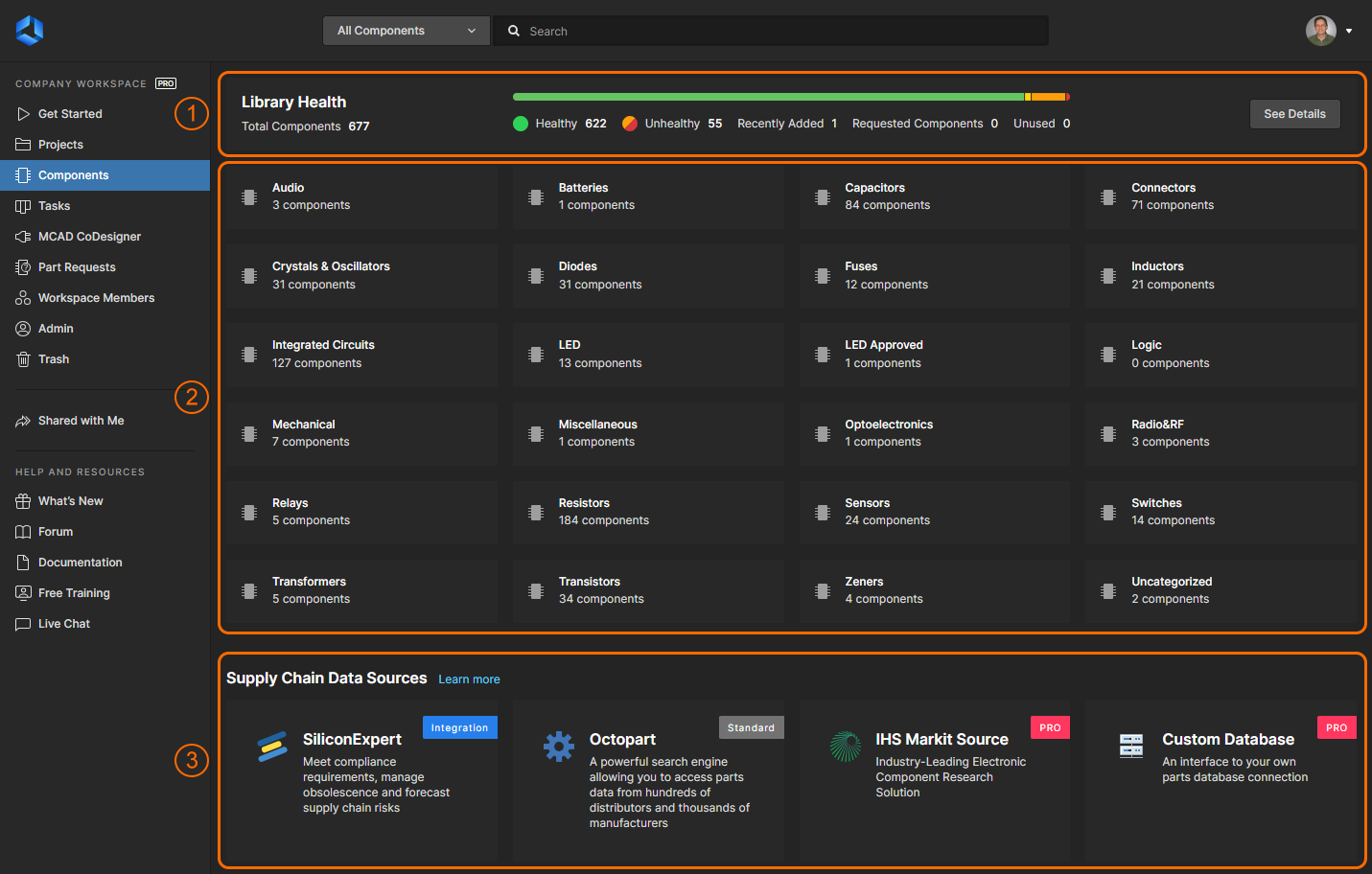 Browse the managed components currently available within your Workspace from the Components page of the Workspace's browser interface. The Library Health region provides a summary of the components and their health.
-
Library Health – this region of the page provides a summary of the health of your components, since last running a health check. Access is provided to the detailed Library Health dashboard page, from where you can run health checks and inspect component health issues in greater detail.
The summary becomes populated once an initial component health check is performed. This is performed automatically the first time the Components page is accessed.
-
Components – when the page is first accessed this region presents a tiled array of the various component types, along with the total number of existing components of each type. From here you are able to drill down to see individual components and get detailed information about them.
-
Supply Chain Data Sources – this region of the page lists the supply chain data sources that are used. The data source can be Octopart, IHS Markit®, other data sources such as SiliconExpert, and your own internal company parts database. For more information on these sources, see altium365.com/capabilities/supply-chain
Access to IHS Markit® Parts Intelligence is fully automated. There's no setup, enablement, or configuration involved – just enhanced data through a monthly sync with the IHS Markit Parts database. This data includes manufacturer lifecycles, part alternates, component parameters (technical) and datasheets.
For many organizations, component supplier data is (and must be) sourced from an internal company enterprise system that provides a proprietary set of parts supplier data – which might be based on a tightly approved range of vendors and/or special pricing structures.
This situation is catered for by the alternative Altium Custom Parts Provider, which when configured for synchronization through Altium Designer, allows the supplier data from a specified database source to be mapped to the Workspace supply chain data. For more details, see Supply Chain Database to Workspace Data Synchronization.
Browsing Components
When first accessed, the Components page presents a summary of the components in the Workspace, by type. Clicking on a tile will present a flat listing of all components of that type. This listing can also be accessed by choosing a component type from the drop-down at the top-left of the page. The type of component category a particular component is listed under is determined by its Component Type parameter. This parameter is specified when creating or editing a component, or when components are imported into the Workspace. See Building & Maintaining Your Components and Libraries for more information.
Since the category a component is listed under is set by its Component Type parameter and not the folder it resides in, moving a component to a different folder – say, using the Explorer panel on the design side – will not affect its type category on the Components page.
► See the design client's Explorer panel and (the equivalent) Components panel for more information.
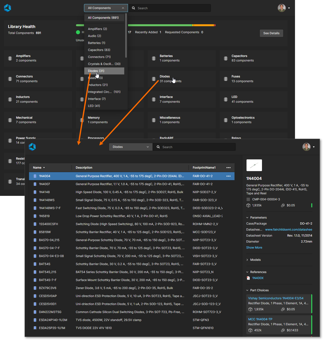 An example of browsing all diode-type components in a Workspace.
Click the

control at the far right of the header region to access a window in which to control which columns of data are displayed. All parametric data can be displayed in unique columns. Use the upper
Search field to quickly find the component you are after.
Selecting a component entry will present detailed information for it within the right-hand pane, as shown in the following image and list:
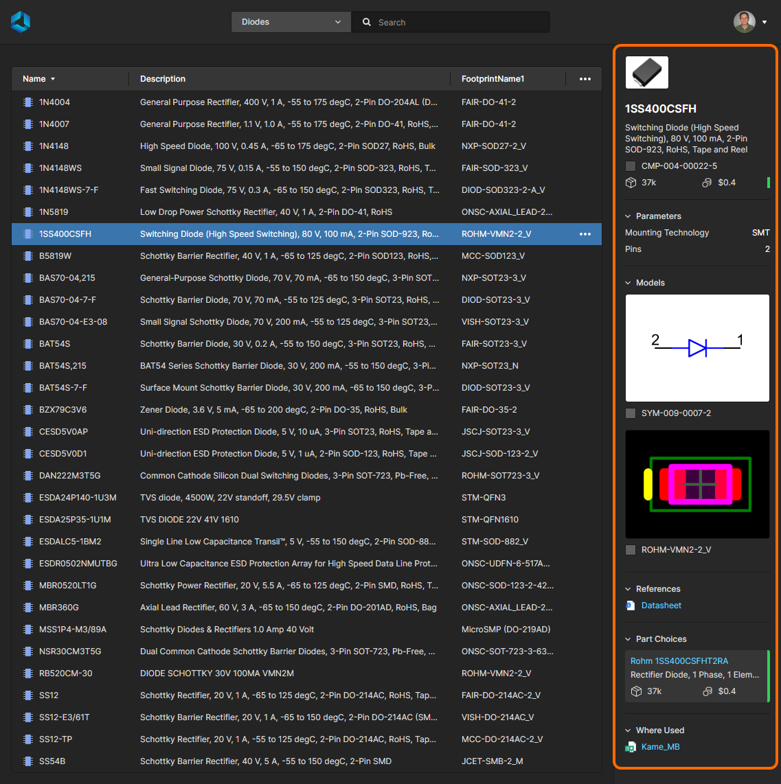 Select a component entry to load detailed information for it in the right-hand pane.
-
Component Name, Description, and Item Revision ID.
-
Revision State icon (
Draft, Production, etc by color) and Revision ID. Also included here is an additional icon if component compliance issues are detected, which will be listed in its associated drop-down menu (view example). These will include information from additional part sources (such as SiliconExpert etc) if enabled (view example).
► See the Library Health Dashboard for more information and suggested resolutions.
-
Stock Availability and median Price.
-
Manufacturer Lifecycle State color icon (on the right) – hover over the icon for further information. A drop-down menu with further information may be included if additional part sources (such as SiliconExpert etc) are enabled (view example).
-
Parametric Data (Parameters).
-
Models – symbol and footprint(s) (Models).
-
Reference Documentation – datasheet(s), pinouts, etc (References).
-
Part Choices entries with manufacturer Lifecycle State color code and supplier Stock/Pricing information (Part Choices). Part Choice tiles will include a predicted lifespan entry (
YTEOL) if additional part sources (such as SiliconExpert etc) are enabled (view example) – use the Get Data option to source the YTEOL data if necessary.
-
Where-used Information – where the component is used (such as in a design project, a managed schematic sheet, or a managed BOM ) with an active link to the parent entity (Where Used).
Accessing the Component View
For each component entry, you can open the selected component in a dedicated viewer that includes the parametric data, models, and supplier information associated with that item's revision. This view is essentially an enhanced version of the component data information presented in the right-hand (Information) pane. To open the Component view for a selected component, double-click on the entry or choose the Open option from its associated  menu.
menu.
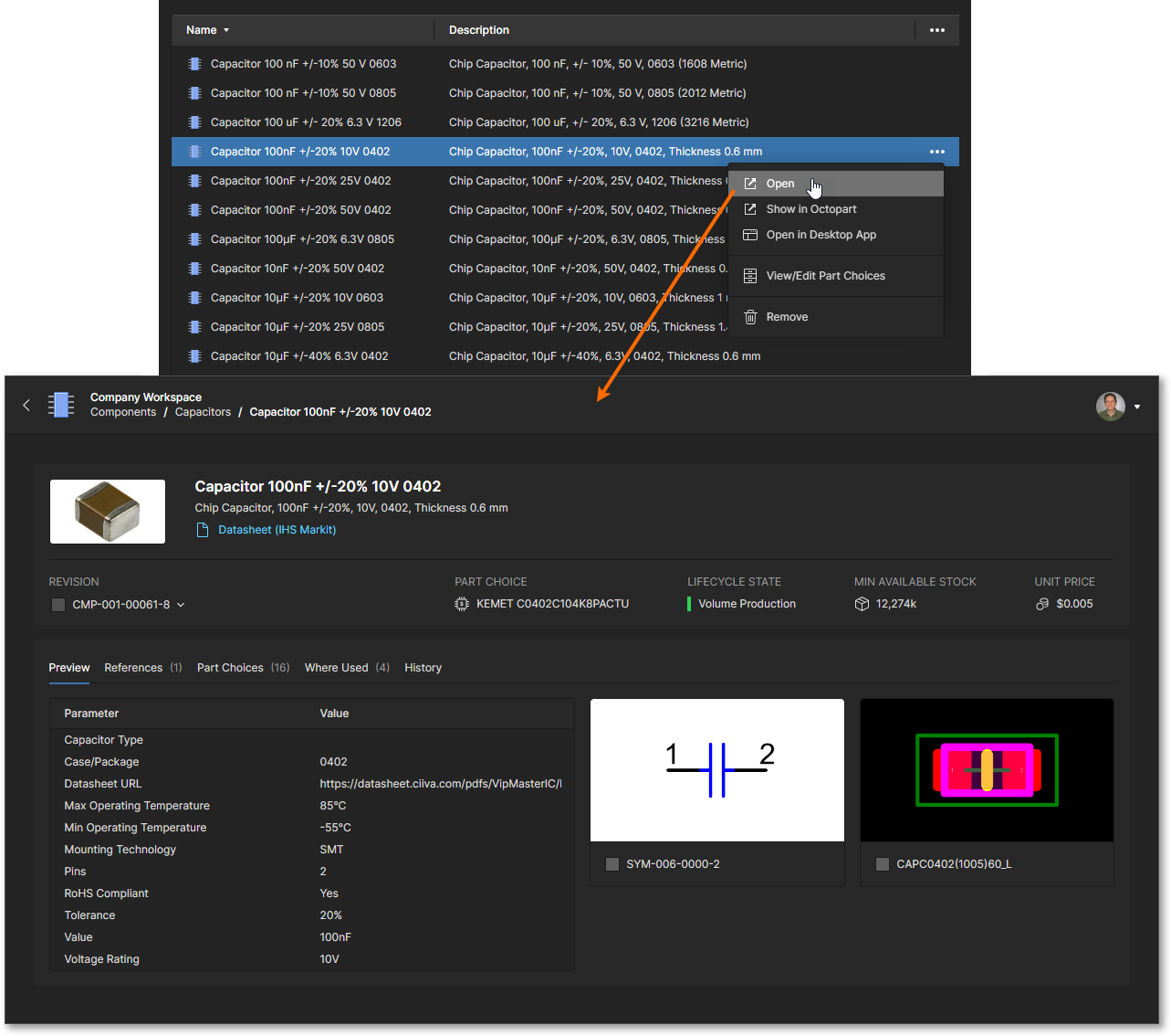 Double-click on a component item entry or use the Open menu option to access a read-only view of the component.
The Component view, which opens in a new browser tab, is formatted to include related information under selectable tabs (Part Choices, Where Used, etc) and also allows a particular component revision to be selected for viewing (Revision drop-down menu). Links included in the tab views are active and will open the target reference (manufacturer/supplier data sheets, where-used entities, etc) in a new browser tab.
|
Data and items associated with the current component can be viewed under the Component Viewer's tab lists. |
Additional features of the Component view include:
-
Detailed Part Choice data – select the Show More option within a Part Choice tile entry to view the component's parameters and details of the supplier options for that manufacturer part.
|
|
Select a Part Choice tile's View More option and the sub-view's Parameters tab to access detailed parametric information for that component.
The view under the SPN tab includes listed supplier part solutions with associated stock information and price break details – click on a Part Number entry to open the related supplier data.
The Alternates tab provides a confidence-rated list of alternative parts provided by the Altium Parts provider sources, which includes each part's associated compliance and supplier information.
An alternative part entry’s associated  menu provides options to add the alternate part as a new Part Choice entry for this component, or substitute the existing Part Choice entry with this alternative part. See below for more information on Part Choices. menu provides options to add the alternate part as a new Part Choice entry for this component, or substitute the existing Part Choice entry with this alternative part. See below for more information on Part Choices.
|
The Stock information included in a Part Choice entry is the sum of the stock levels available from the enabled Suppliers, as defined in the Altium Part Provider source accessed through the Admin – Part Providers page. The Part Choice pricing information is the lowest price of the lowest available MOQ solutions – typically the unit (single item) price.
Note that the stock/price information is derived from only those enabled suppliers who offer a purchasing solution for the part.

-
If Altium 365 SiliconExpert Integration is available and activated in your Workspace, its advanced parameters and data can be enabled for the detailed Part Choice view by selecting the Get SiliconExpert Advanced Part Data option. When this data is enabled:
-
The Datasheet link in the Part Choice tile's header will include access to datasheets sourced from SiliconExpert, if available.
-
The Parameters tab also includes the available set of advanced Silicon Expert parameters – scroll down the list to view. The available parameters are specified by the Data Visibility Settings in the SiliconExpert App configuration.
-
The Alternates tab includes SiliconExpert sourced alternative part suggestions – indicated by the
 icon. Hover over an entry and use the associated
  menu (on the right) to apply the alternate as a Part Choice.
-
The additional PCN tab lists Part Change Notices sourced from SiliconExpert. This is a chronological list of notifications issued by manufacturers to inform customers of a product, process, or company change that may affect the potential use of the component part.
-
Similarly, if Altium 365 Z2Data Integration is available and activated in your Workspace, its advanced parameters and data can be enabled for the detailed Part Choice view by selecting the Get Z2Data Part Data option. When this data is enabled:
-
The Datasheet link in the Part Choice tile's header will include access to datasheets sourced from Z2Data, if available.
-
The Parameters tab also includes the available set of advanced Z2Data parameters – scroll down the list to view.
-
The Alternates tab includes Z2Data sourced alternative part suggestions – indicated by the
 icon. Hover over an entry and use the associated
  menu (on the right) to apply the alternate as a Part Choice.
-
Component Revision access – choose a component item ID option from the Revision drop-down menu to view an earlier version of the Workspace component (as denoted by its ID number suffix). An associated
 icon indicates that you are not viewing the latest revision, which will also appear if a newer version becomes available (such as when the component has just been modified/updated).
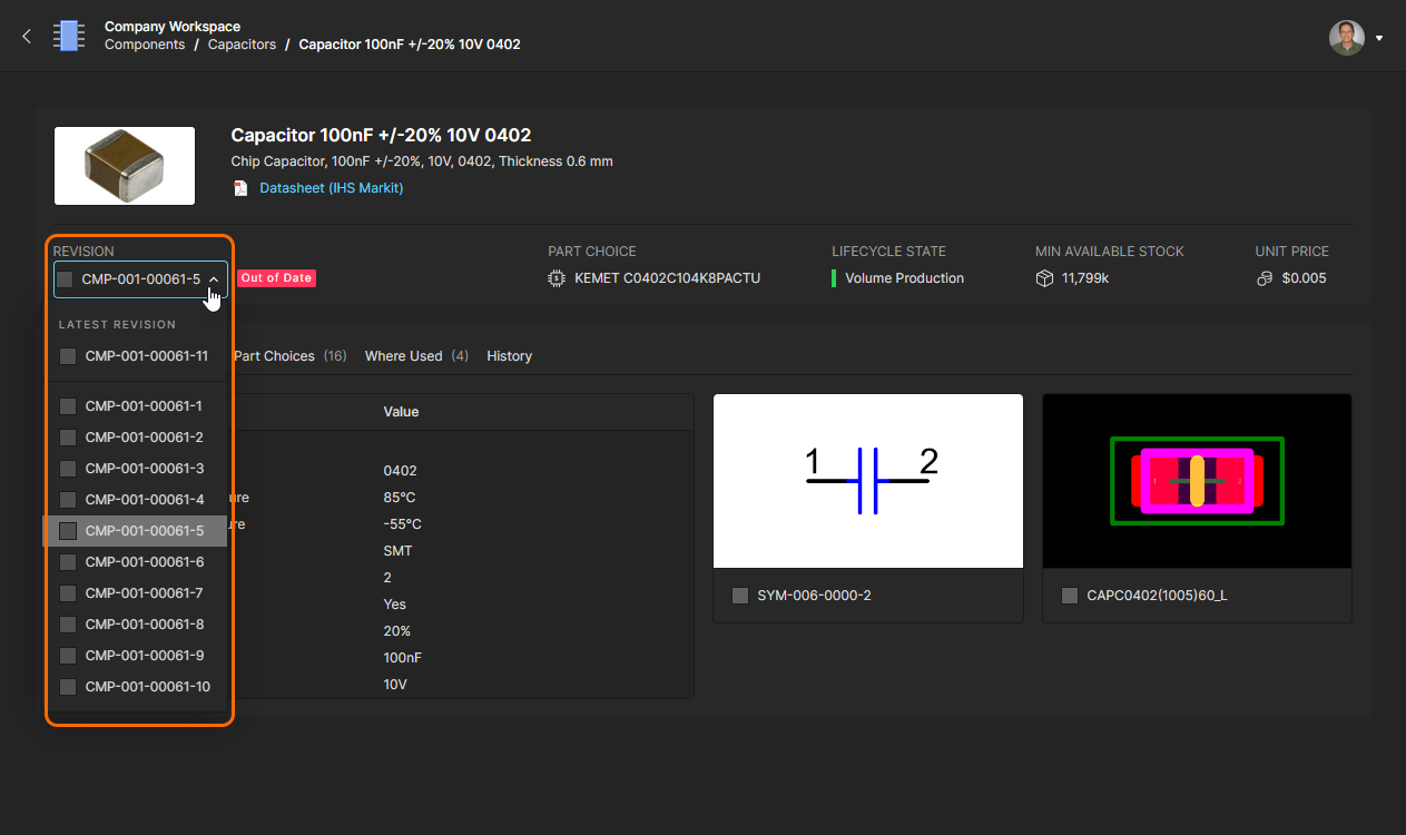 Use the revision drop-down menu to select and view an earlier revision of the current component, which will be classed as out of date.
View/Edit Part Choices
The manufacturer part choices associated with a component can be viewed and edited from the Component view's Part Choices tab, or accessed directly from the main Components page by choosing View/Edit Part Choices from a component entry's  menu. Each Part Choice tile presented in the view includes sourced stock levels, pricing, and active links to manufacturer part information. The default order of listed Part Choices is determined by suitability (cost, stock levels, etc) but may be manually reordered by specifying its star ranking – the top 'preferred' entry in the list is used as the component's Part Choice in a BOM document.
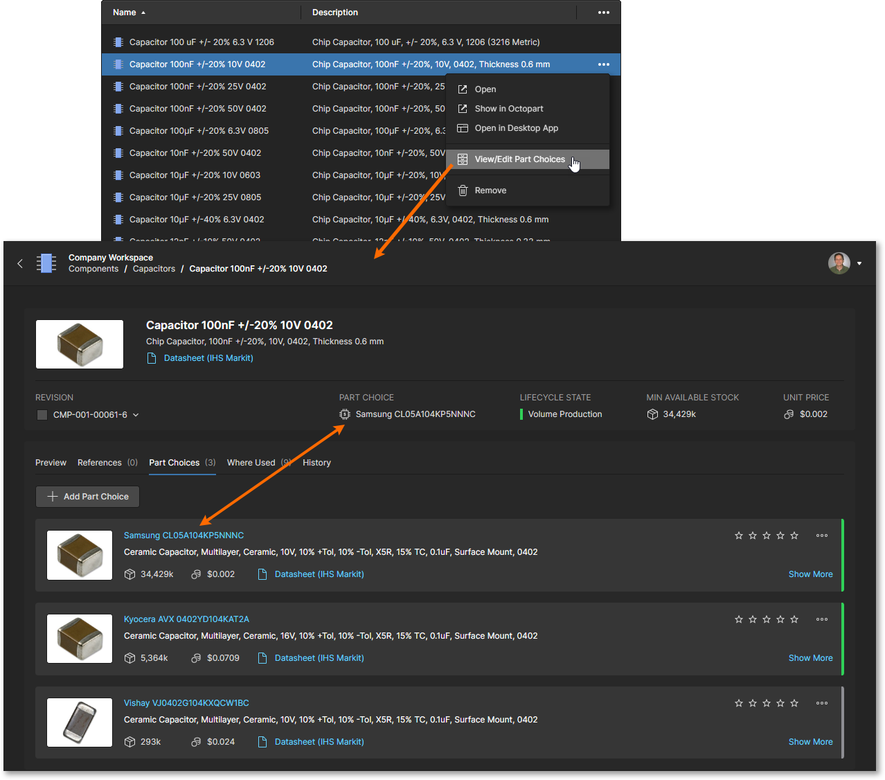 The manufacturer Part Choices associated with a component can be added or removed. Use the star ranking to determine the preferred Part Choice data.
Use the  button to include a new Part Choice entry. The manufacturer search window will default to the name of the component that is currently being viewed, but can be edited to search for other parts by collated parameter terms or part number. Components listed in the search results include columns summarizing their standards compliance (
RoHS etc) and supplier stock/pricing information.
If Altium 365 SiliconExpert Integration is enabled for your Workspace, the Part Choice search results will include additional YTEOL (Years To End Of Life), Lifecycle and ROHS parameters sourced from SiliconExpert. Note also that Part Choice tiles in the component view will include the YTEOL parameter. See example view.
Select a suitable entry's  button to confirm your choice, which is then added as a new Part Choice entry – select the highest star ranking if you wish to move it to the top of the Part Choices list. Note that Part Choices are associated with a component, so a change in Part Choices does not invoke the creation of a new component revision.
❯ ❮
Javascript ID: B
The Add Part Choice feature performs a controlled search of component parts data to curate a relevant list of manufacturer part choices.
|
Each Part Choice includes additional management options, including:
-
Show More – view the Part Choice entry's detailed parametric and supplier part data.
-
Delete Part Choice (
 menu) – remove the Part Choice entry from the list.
-
Clear Rank (
 menu) – revert the entry's current star ranking to an unranked state (no selected stars).
-
Star Ranking – select a star icon to set the Part Choice entry to that level of preference. The entries are automatically reordered by ranking, where the topmost Part Choice becomes the default used by this Workspace component.
|
|
Select a Part Choice entry's star ranking level to set its usage priority. Note that the component's current part choice (PART CHOICE) corresponds to the top entry in the list.
The newly applied star ranking in this example (five stars) moves the Part Choice entry to the top of the list, and therefore the component's default part choice.
The change can be confirmed by viewing the component where it is used, such as in a BOM document. Double-click on an Item in the component's Where Used list to open that project or design document.
The component entry within the opened project BOM document will show that component's top-rated Part Choice as the Manufacturer/Manufacturer Part Number entry.
|
Removing a Component
You can also remove a component from the listing (provided you have editing rights to the folder in which it resides). To do so, select the component entry, choose the Remove command from the associated  menu at its far right and confirm the removal in the following window. The action is a 'soft delete', whereby the component will be moved into the Trash area of the Workspace.
You can also opt to remove the component's child items (e.g. symbol, footprint model(s), simulation model, datasheet) by checking the Remove related items option – to view the names of these items hover over the window's  icon (see example). Note that these cannot be removed if they are being used elsewhere (by one or more other components).
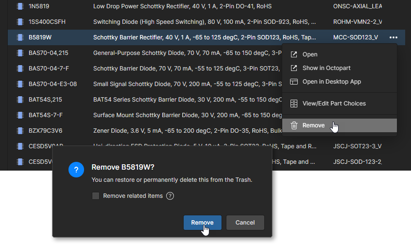 Remove a component directly from the Components page. This is a 'soft delete', with the component (and any related items as applicable and permitted) moved to the Trash.
When confirmed with the  button the component will be removed from the main listing, or a window will appear with details on any issues with the removal process, such as:
-
Items associated with the component (symbol, footprint, etc) are being used by another component. In this case the selected component entry will be removed, but not those items used elsewhere. Hover over the window's issue entry for more detail.

-
The selected component is being used in an existing project design, as can be confirmed by the component's Where Used entry. This warning can be ignored by proceeding with the window's
 button (not recommended).
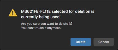
All components/items successfully removed can be found on the Trash page of the interface. Note that you only can view components (and any other items for that matter) that you have personally removed (soft deleted). Administrators will be able to see the full content of the Trash page – all items that have been soft deleted.
Things to consider in relation to a removed (soft deleted) component:
-
The component will not be available from your design software, or from within the Web interface.
-
Anywhere the component was being used will reflect that the component has been removed.
-
A component can be restored or permanently deleted from the Trash page. Permanent deletion is only possible if it is not being used on a managed schematic sheet, or within a design, as reflected in the component's Where Used information.
Note that if you have removed (soft deleted) a component – moved it to the Trash – you can create a new component with that same name again. If you were to subsequently restore the original component and the original name is taken, an integer suffix will be used to keep its name unique within the Workspace.
Accessing the Manufacturer Datasheet
The option to view a component's manufacturer datasheet can be available where the selected component includes a valid Datasheet URL parameter (see example). In this case you can directly access the datasheet by choosing the Open Datasheet option from the  menu at the far right of the component entry. You can otherwise open such a link from the component Properties pane. The linked datasheet will open in a new browser tab.
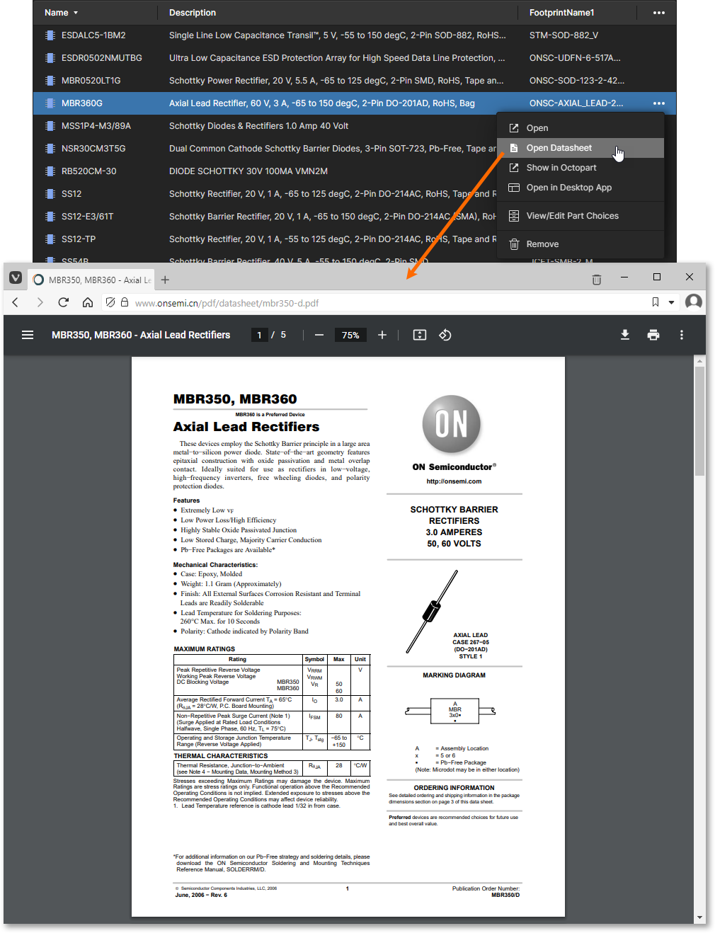 Quickly access the manufacturer datasheet for the selected component, which opens on a separate browser tab.
Accessing the Component Page in Octopart
For each component, you can quickly access its page within the Octopart site (which opens on a separate browser tab). To do so, select the component of interest, click the  control at its far right, then choose the Show in Octopart command from the associated menu.
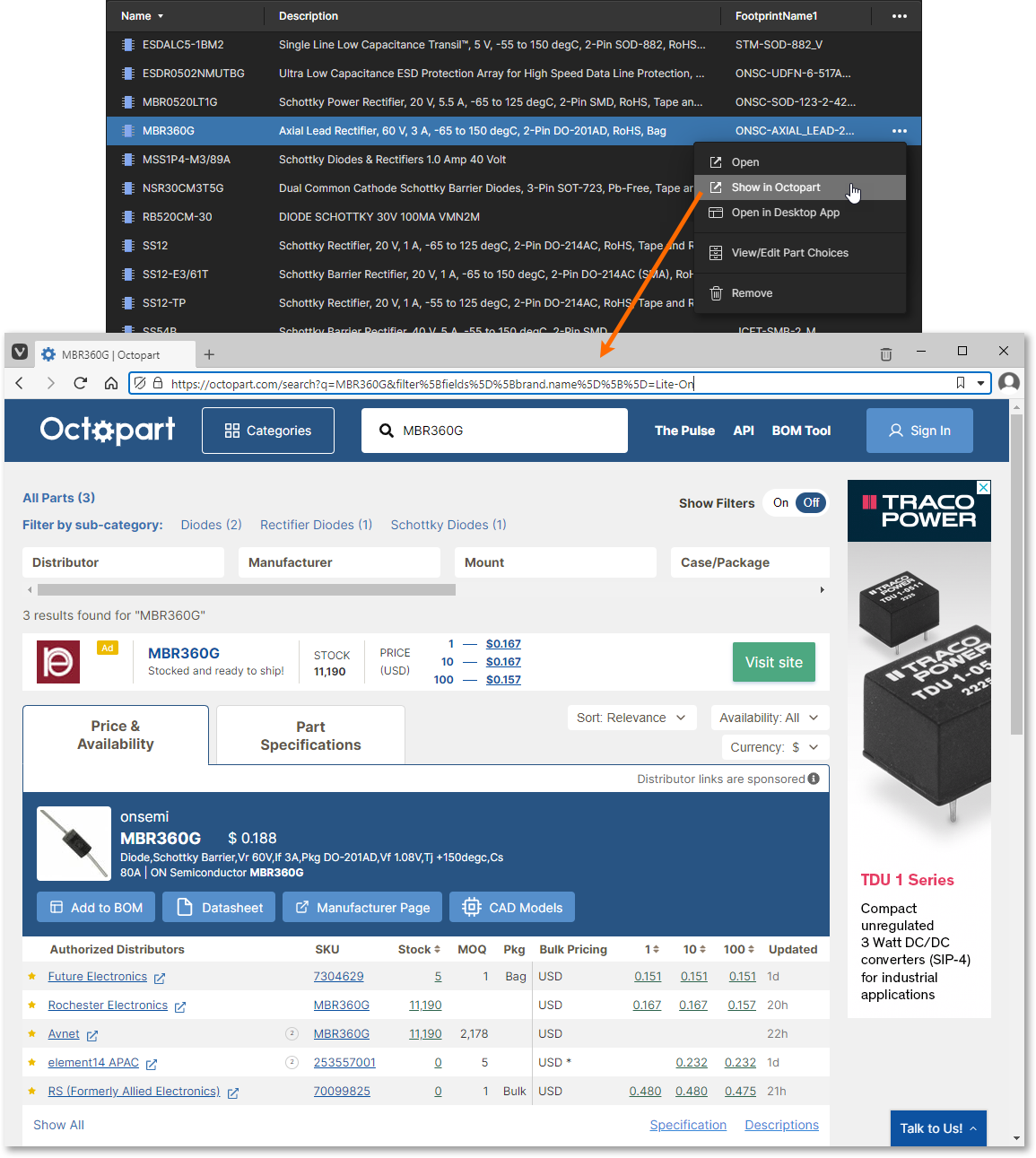 Quickly access the page on the Octopart site for the selected component, which opens on a separate browser tab.
Library Health Dashboard
The top region of the Components page – Library Health – presents a high-level summary of the overall health of your Workspace components.
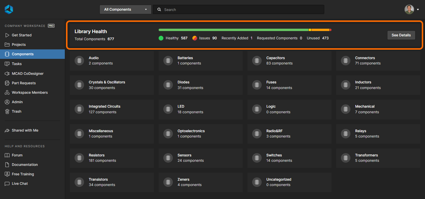 The Library Health region of the Components page summarizes the health of the components stored in your Workspace.
The summary becomes populated once an initial component health check is performed. This is performed automatically the first time the Components page is accessed.
As well as a useful visual indicator of health, the following information is presented:
-
Total number of components in your Workspace. This is the sum of healthy components plus those components that have an issue (fatal error or error).
-
The number of components that are completely healthy.
-
The number of components that have an issue. Bear in mind that a particular component may have more than one issue.
-
The number of components that have been recently added to the Workspace – in terms of the volume of the latest batch of new components created. For example, if yesterday two components were created in the Workspace and then three more were created today, the number reflected on the dashboard will be
3.
-
The number of requested components – as part of the Part Requests feature.
-
The number of unused components – not used in a managed schematic sheet, or directly within a design.
The health indicator bar visually conveys to you the health of your components. It reflects healthy components (those with no issue detected) in green, along with those that have a warning (yellow) and those with an issue – either an error (orange) or a fatal error (red).
Accessing the Main Library Health Dashboard
Click the  button to access the detailed Library Health dashboard page. The top of the page presents the same summary information found at the top of the main Components page of the interface. Beneath that are the health check analyses that are supported, which are gathered into various Issue Themes.
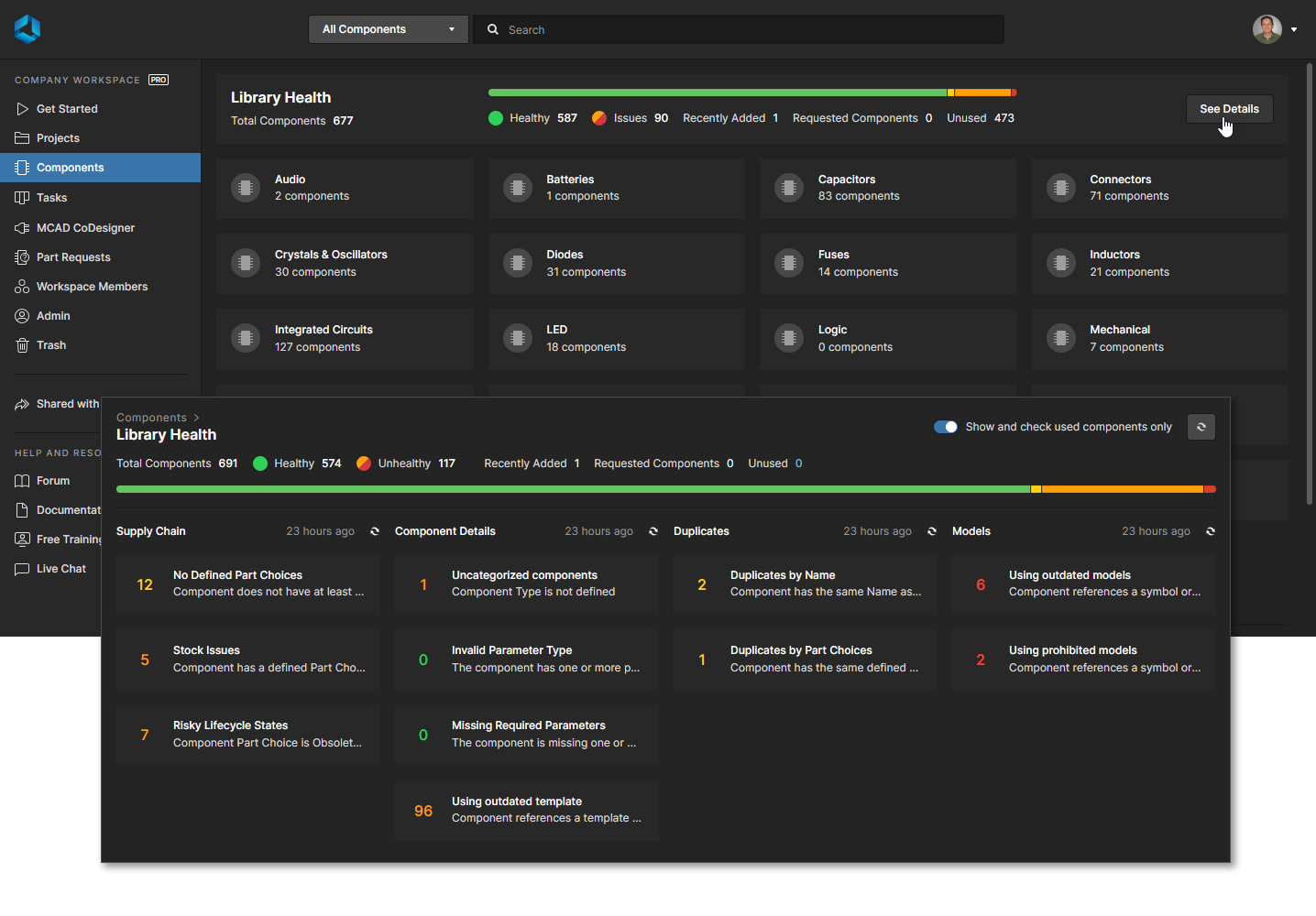 Accessing the detailed Library Health dashboard page – command central for analyzing issues in greater detail.
-
Enable the Show and check used components only option, at the top-right of the dashboard, to only present health checking data for components that you are actually using in your designs (or managed schematic sheets). When the dashboard is refreshed – health checking is performed – all unused components will be excluded from checking.
-
Additional/expanded issues themes are available in the Library Health Dashboard if Altium 365 SiliconExpert Integration is enabled (and set up) for your company. See the Supply Chain health section below for more information.
The following issue themes and health check analyses are currently supported in the Health Dashboard:
Supply Chain
-
No Defined Part Choices – a component fails this health check if it does not have at least one Part Choice defined and therefore has no link to a Manufacturer Part. Less Part Choice critical passive components such as Capacitors and Resistors can be excluded from the list by selecting the Ignore Passive Components option within the opened issue tile.
-
Stock Issues – a component fails this health check if it has a defined Part Choice that is not in stock.
-
Risky Lifecycle States – a component fails this health check if it has a Part Choice that is obsolete, not recommended for new designs (NRFND), or invalid. You may encounter challenges in purchasing and supplying your design components in these states.
-
Risky Lifecycle States ( ) – Expands the above Lifecycle theme with additional lifecycle analysis data when the Altium 365 SiliconExpert Integration feature is enabled for your company. A component will fail this health check if it has a Part Choice that is obsolete, not recommended for new designs (NRFND), or invalid. See example.
-
Predicted Supply Chain Issues ( ) – This issue theme is available when the SiliconExpert Integration feature is enabled for your company. A component will fail this health check if the Years To End Of Life (YTEOL) property is less than 1 year. A YTEOL of less than 2 years is categorized as a Warning. See example.
Each health check analysis tile reflects the number of components failing that health check. Color coding reflects healthy/no issues (green), fatal error (red), error (orange), and warning (yellow).
Browsing a Health Check Analysis
Clicking on a health check analysis theme tile will provide a more detailed description of the check with suggested steps to resolve any issues (where available), as well as a detailed listing of all components failing that health check.
Along with the listing's default data columns – Name, Description, etc – additional columns may be added through the  control drop-down options at the far right of the header region. Select Show More in the window to enable the full list, and check a parameter name to add its data as a column in the main analysis list.
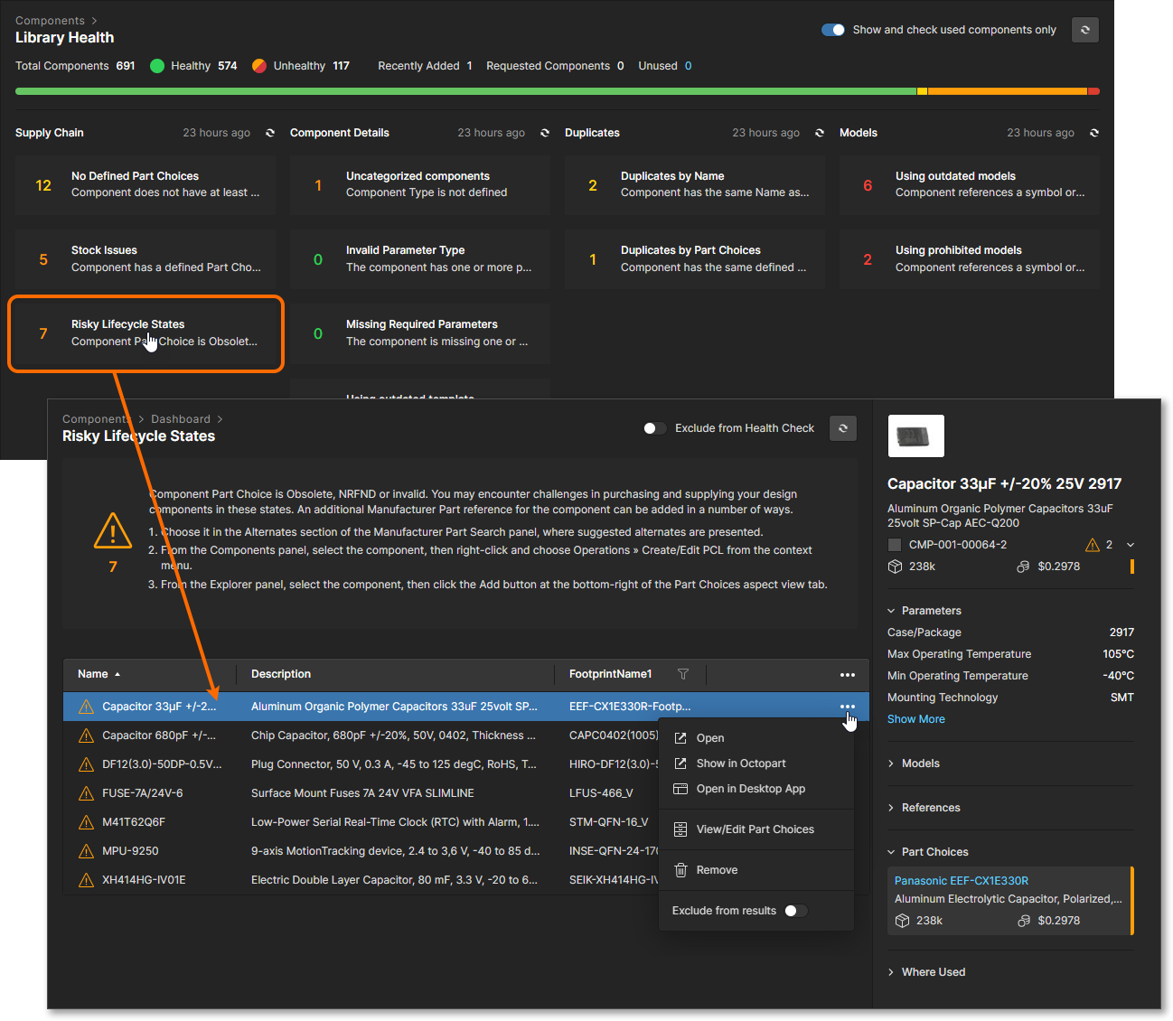 Inspecting components that are failing a specific health check – caught by that check's corresponding analysis.
Selecting a component entry will present detailed information for it within the right-hand pane – the same as that presented when browsing components through the main Components page of the interface. Use an entry’s  drop-down menu to access the range of options available for that part:
-
Open – open this part in the dedicated Component view to inspect its full details. See Accessing the Component view.
-
Show in Octopart – access the related component page within the Octopart website, which opens in a separate browser tab.
-
Open in Desktop App – view this component part in Altium Designer’s Components panel. If Altium Designer is not already active you will be prompted to open its executable (
X2.exe).
-
View/Edit Part Choices – directly open the Part Choices tab for this part in the Component view, where the current choices can be accessed in detail and new Part Choices added for this component. See View/Edit Part Choices.
-
Delete – move the selected part to the Workspace Trash (a restorable 'soft' delete).
-
Exclude from results – prevent this component part from being included in the health check analysis. The part will not be checked or included in the report statistics, but will be listed in the applicable issue theme view with a gray icon (
 ) to indicate that it is excluded from health checks. Note that entire themes also can be excluded from health checks – see Excluding Components from a Health Check Analysis below.
In the dashboard's upper information list, click the number associated with unused components (Unused) to open a full list of those components and their details. Note that Workspace components that are not currently used (such as in projects, schematic sheets, BOM files, etc) are able to be listed when the Show and check used components only option is deselected.
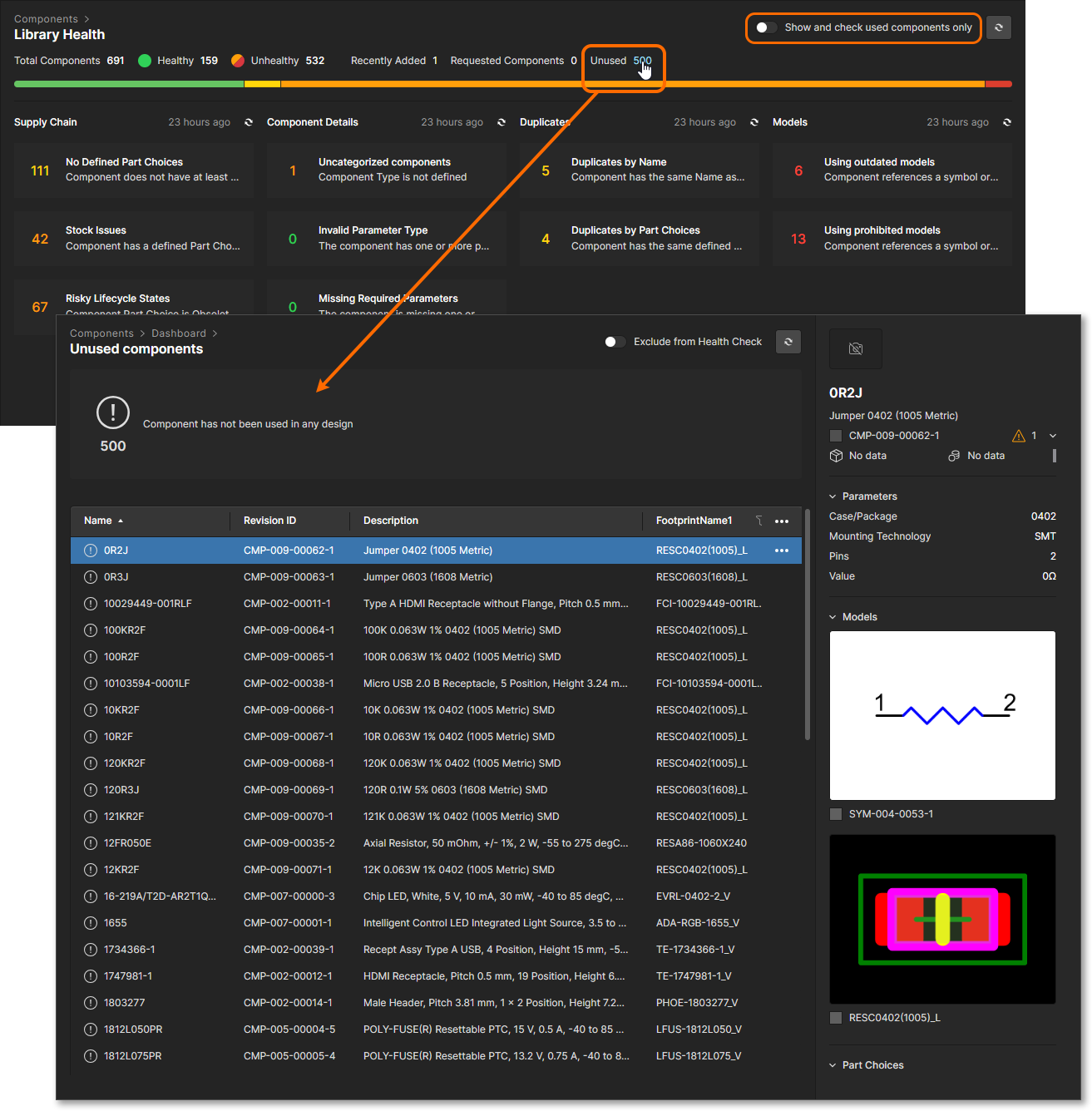 Select the unused components number link to open a full list of those components.
Refreshing the Dashboard
Library Health reports will update automatically within a day (typically after 9 hours) in response to a changed component part, such as when a component is released or its Part Choices updated. The Health Reports can otherwise be manually updated by refreshing all reports or a specific report in the detailed analysis dashboard page.
The two levels of manual update, a comprehensive (all reports) update or partial (specific report) update, are available through associated refresh buttons:
-
Comprehensive Dashboard Refresh – running an update across all issue themes and their associated health check analyses. This level of refresh is performed by clicking the
 button, at the top-right of the main Library Health dashboard page. During the refresh, the button will change to
  and the text
  will appear next to each of the supported issue themes.
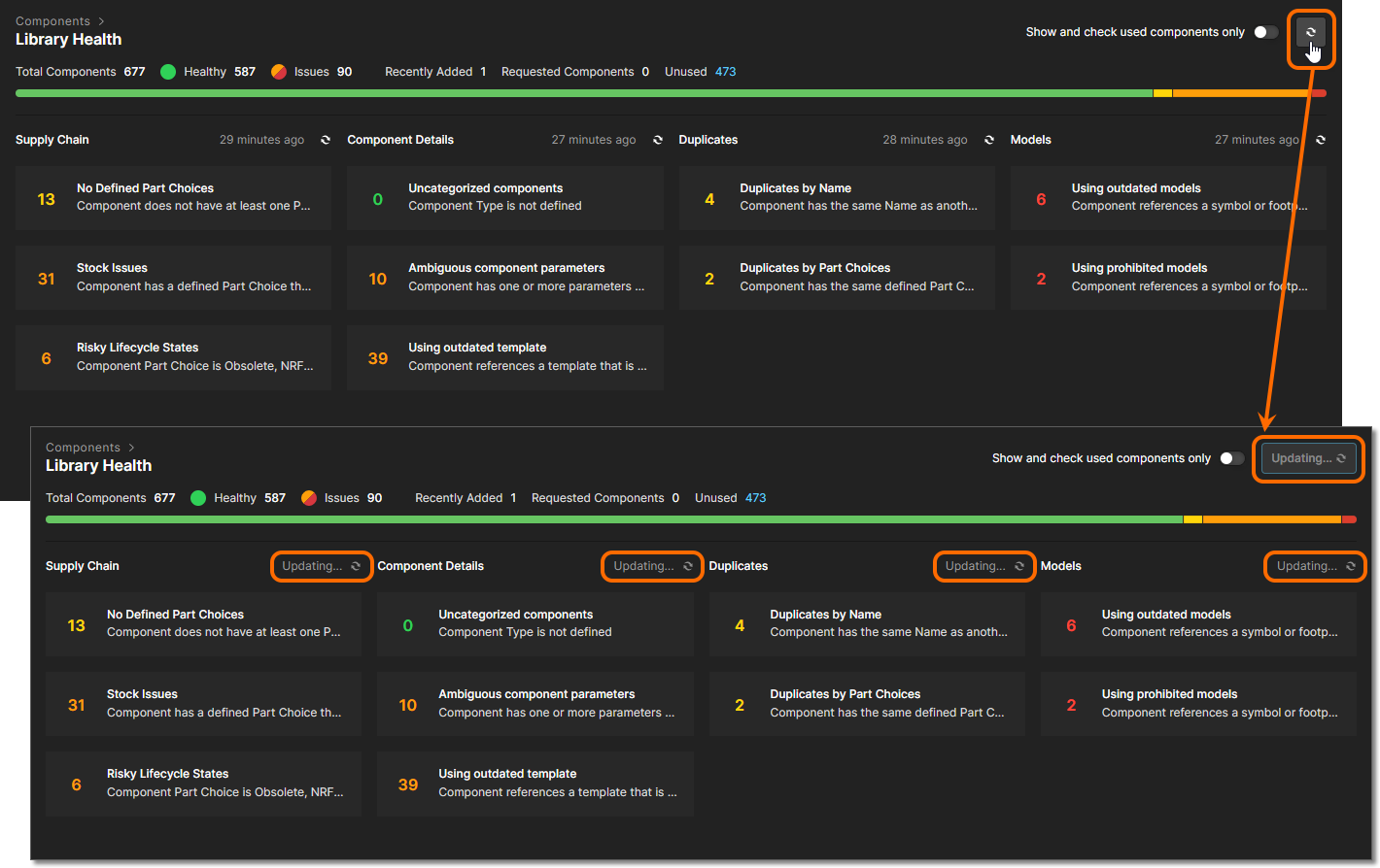 Run a full health check update by performing a comprehensive dashboard refresh – involving all health check analyses across all issue themes.
-
Partial Dashboard Refresh – running an update across all associated health check analyses in a particular issue theme. This level of refresh is performed from two places – by clicking the
 control next to the issue theme entry on the main Library Health dashboard page, or by clicking the
  button in the heading of the detailed page when inspecting one of the health check analysis types in that issue theme.
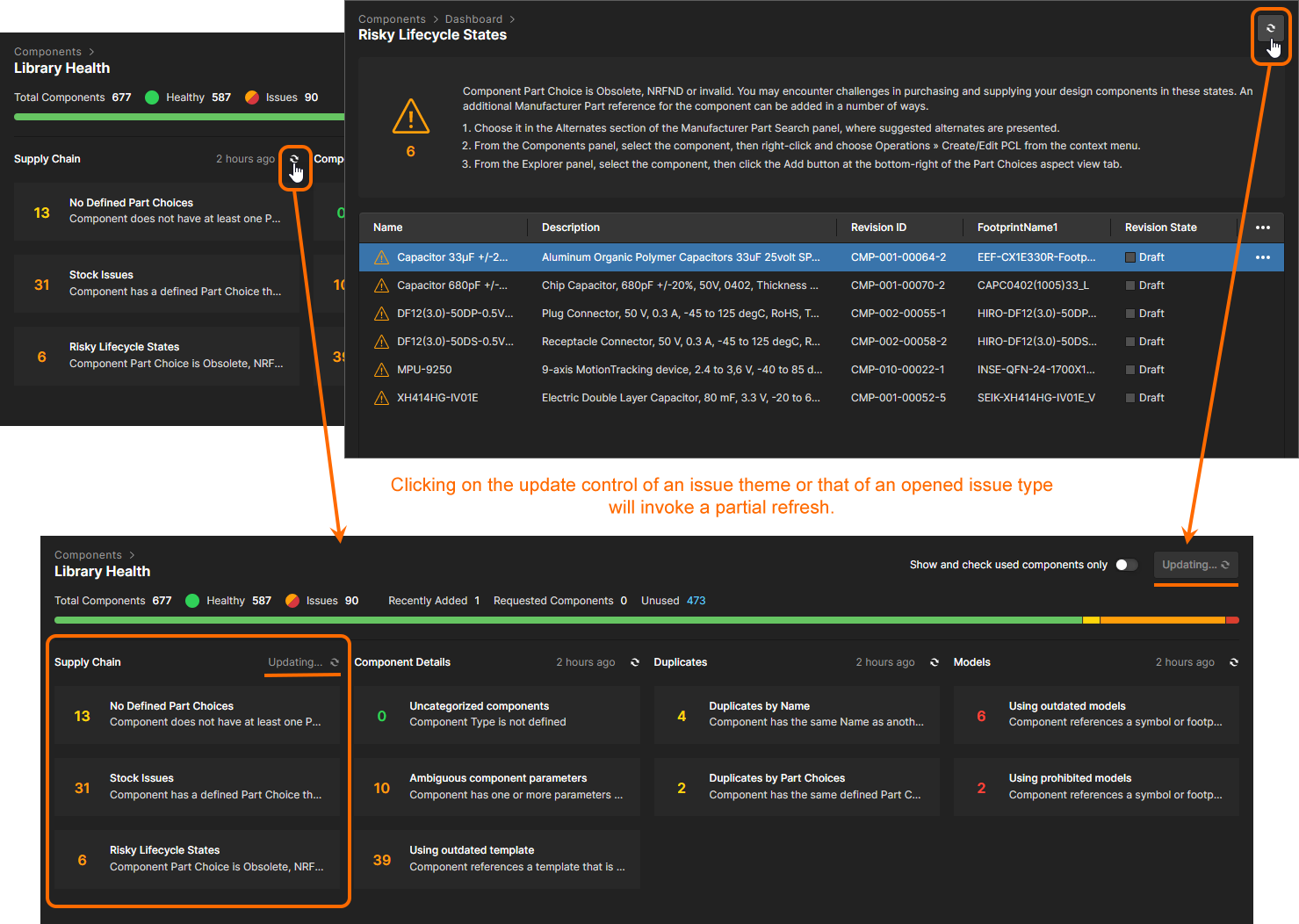 Run a partial health check update – involving all health check analyses associated with a specific issue theme.
Excluding Components from a Health Check Analysis
You can exclude component filter categories or individual components from a health check analysis. To do so, open an issue category and enable the Exclude from Health Check option to remove the entire category from the check, or enable a selected component's Exclude from results  menu option to remove just that component from the check results.
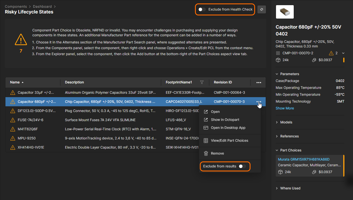 Exclude an issue theme or a specific component from a health check analysis.