An expansive set of technical documentation is provided across the range of design solutions available from Altium. This document provides a handy set of 'tips and tricks' when using the documentation to find what you need, no matter whether you're looking for how to use that next cool feature or enhancement in Altium Designer, hook up your mechanical design software to get going with ECAD-MCAD CoDesign, or take collaboration to the next level with the help of Altium 365.
Accessing Technical Documentation
The main gateway to the technical documentation - the 'front door' as it were - is: https://www.altium.com/documentation/.
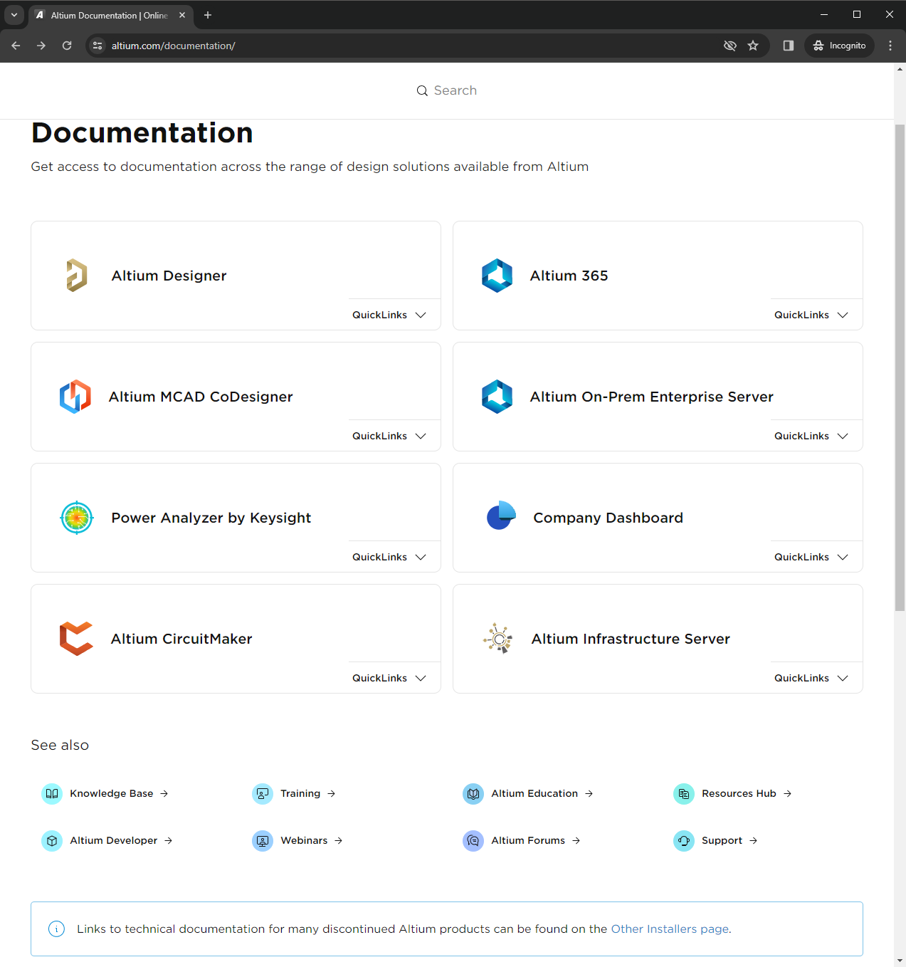
Working with the page:
- Click within a main tile to access the home page of the technical documentation for that particular design solution.
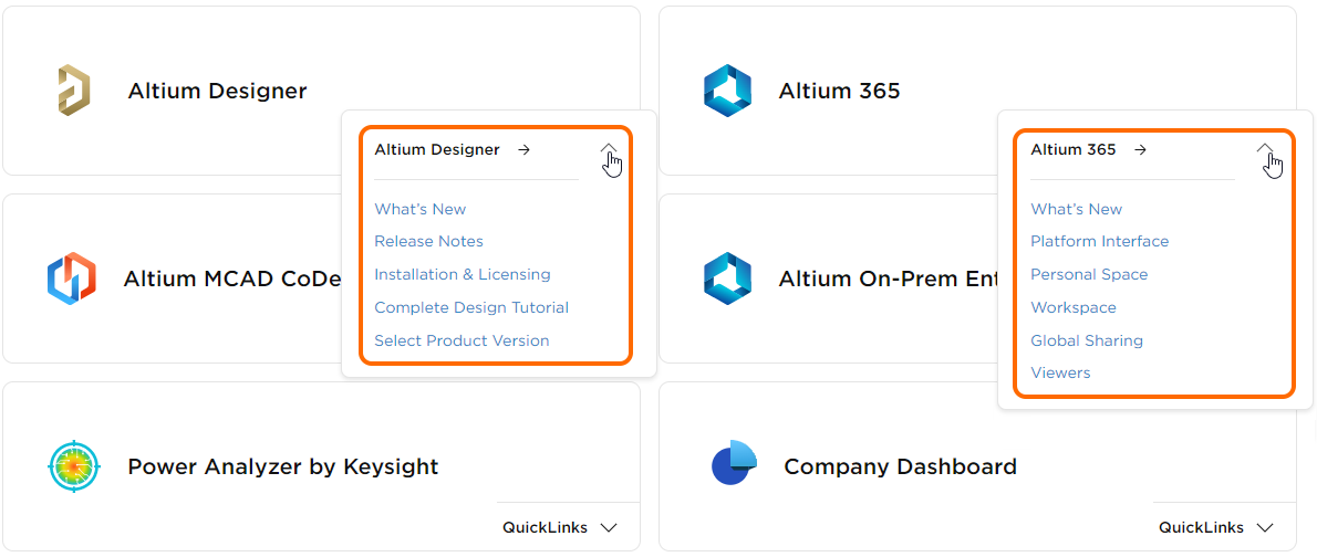
- Use the available QuickLinks menus to access key paging within an area, as shown below for the Altium Designer and Altium 365 documentation tiles.
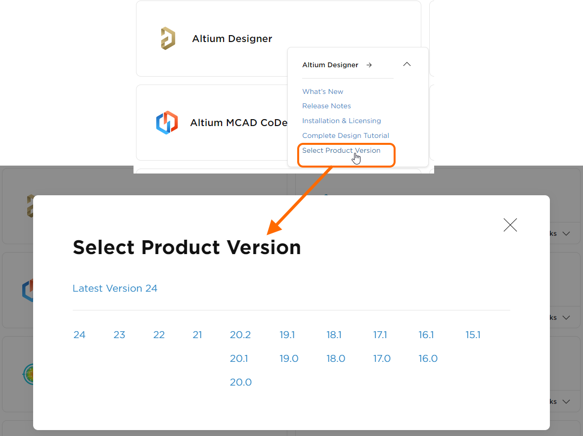
- For a solution whose technical documentation is versioned, use the Select Product Version entry (on the associated QuickLinks menu) to 'dial up' the required version, based on the version of the software you have, as shown below for Altium Designer. Don't worry if you need to change version at a later stage, this can be done from within the documentation. For more details, see Versioned Documentation.
- Use the Search field at the top of the page to quickly search across all technical documentation for all design solutions (and versions thereof, where applicable), as well as the Knowledge Base. For more details regarding the search feature, see Documentation Search Facility.
Use the
See Also links to access other useful resources Altium has to offer, such as the
Knowledge Base, the
Resources Hub (full of interesting and focused articles, many written by industry experts), and the
Altium Forums (an invaluable learning resource with information directly from your peers).
Should a product have been discontinued along your journey with Altium, it's likely that its technical documentation is still available. In such cases, you'll find a relevant entry point next to the software download link on the
Other Installers page.
Direct Access with 'F1'
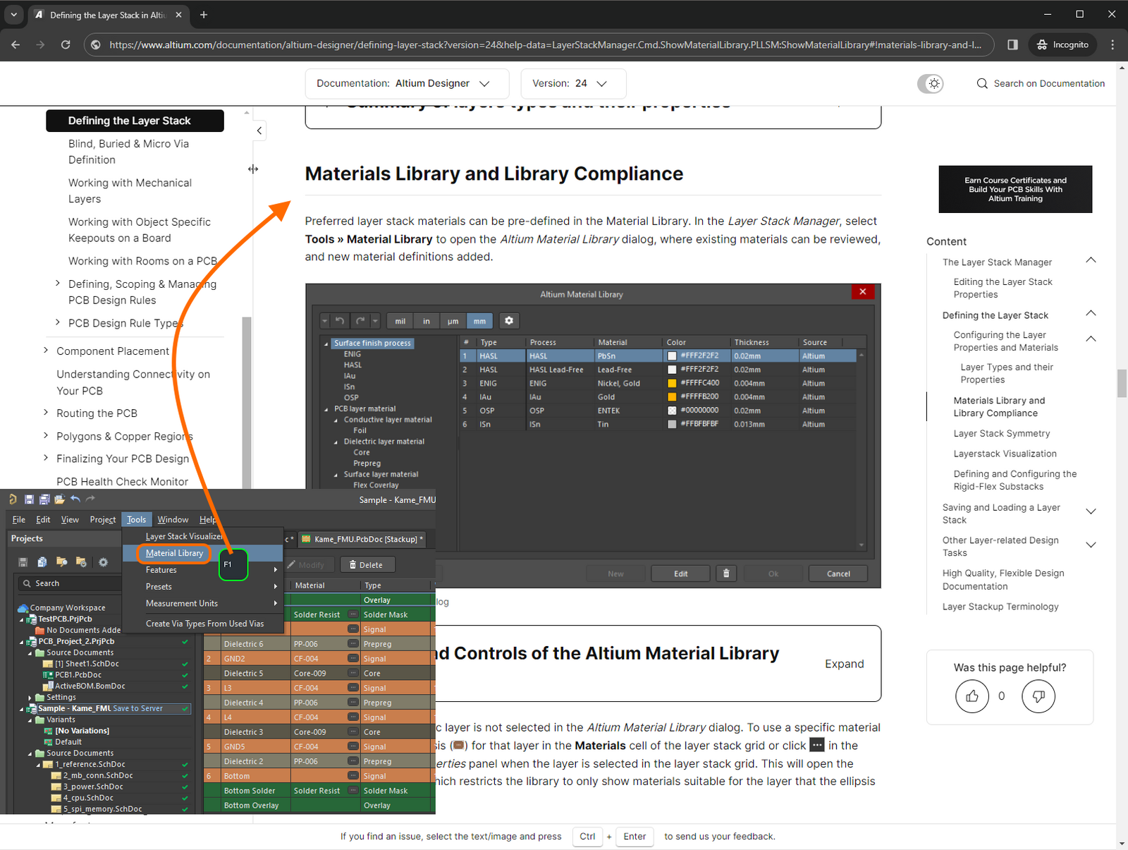
For design software including Altium Designer and CircuitMaker, the F1 keyboard shortcut is definitely worth getting acquainted with. Hover the mouse over many of the resources in the software's environment - a menu command, dialog, panel, design object, or query language keyword - then press F1 to access documentation for it. Facilitating this connection between software resource and technical documentation is a mapping file (*.HelpID), which resides in the \Program Files\Altium\AD<Version>\Help folder of the main installation.
When accessing the documentation using F1, you will automatically be taken to the correct page for your version of the software.
The following image illustrates the feature in action. Here, the F1 keyboard shortcut is being used to access documentation for the Material Library command, available when editing the layer stack for a PCB using the Layer Stack Manager.
F1 Updates
For supported design software, the HelpID mapping file in the installation's main \Help folder gets updated with each new release of that software. However, there are times when the Technical Documentation team make updates to the mapping file in-between releases. In support of getting the latest F1 changes out to our users, without having to wait for that next release of the software, we employ an on-the-fly update approach, that utilizes the Check frequency setting, on the System - Installation page of the Preferences dialog.
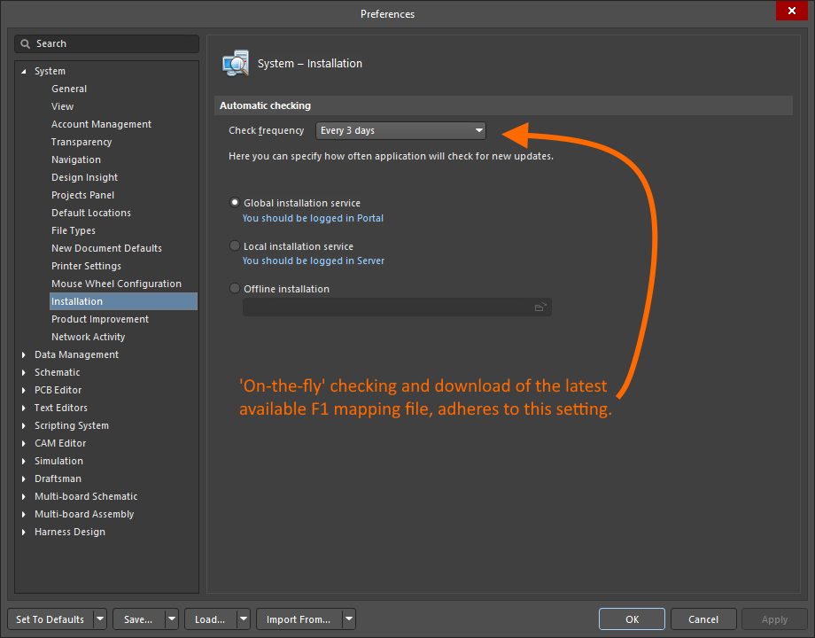
Provided the checking interval has elapsed, the next time the F1 feature is used, a later version of the mapping file is downloaded to the \ProgramData\Altium\Altium Designer <GUID>\Help folder. This later version of the HelpID file takes precedence over the default file in the main installation's \Help folder.
Alternate Methods of Access
The technical documentation can also be accessed in various additional ways, including:
- Through an external search using your Web Browser's search engine, for example Google. To focus such a search to the Altium documentation, enter the site as a prefix, using the format
site:altium.com/documentation <Search String> (e.g., site:altium.com/documentation PCB Layout Replication).
- By following a link supplied in an official Forum Post from Altium.
- By following links available in other areas of the main altium.com website (e.g., from the Resources area or from dedicated 'What's New' and feature-level pages).
- By following dedicated links in the software. For example from a Help menu, or using 'Learn More' (or similar worded) links.
The Documentation Interface
The documentation interface essentially comprises up to 11 distinct regions, shown in the following image and detailed thereafter.
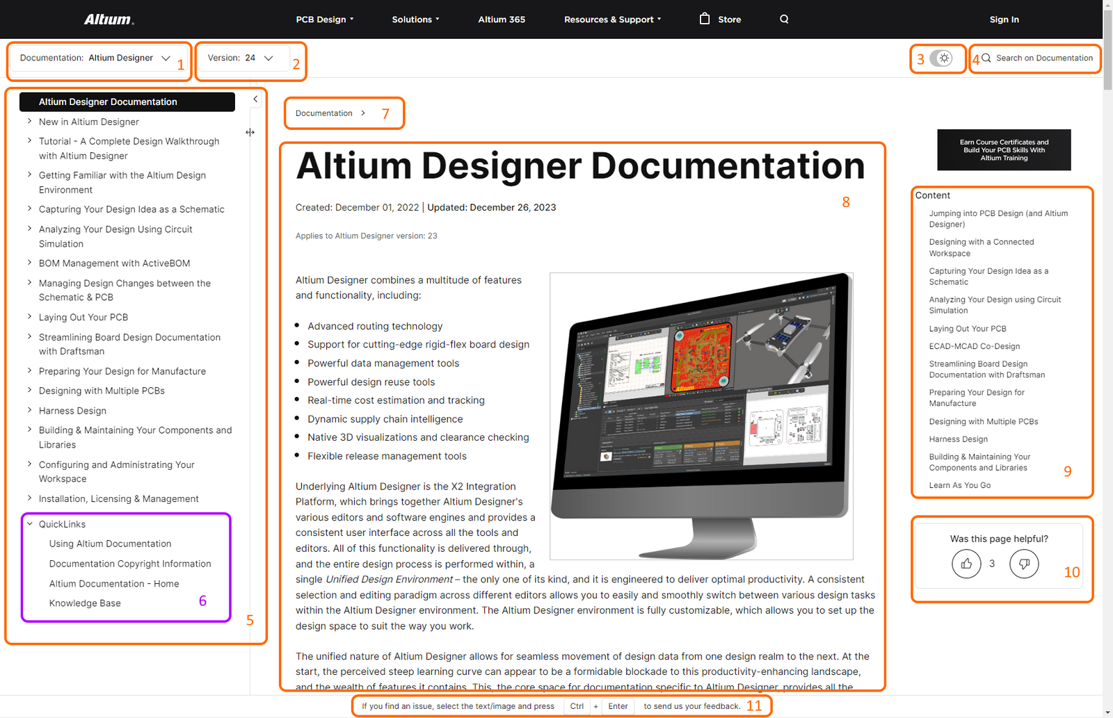
- Product Documentation Selector - use this control to switch between the dedicated sets of technical documentation available for the various Altium design solutions.
- Version Selector - use this control, where available, to ensure you are viewing the correct documentation for the version of product you are using. For more details, see Versioned Documentation.
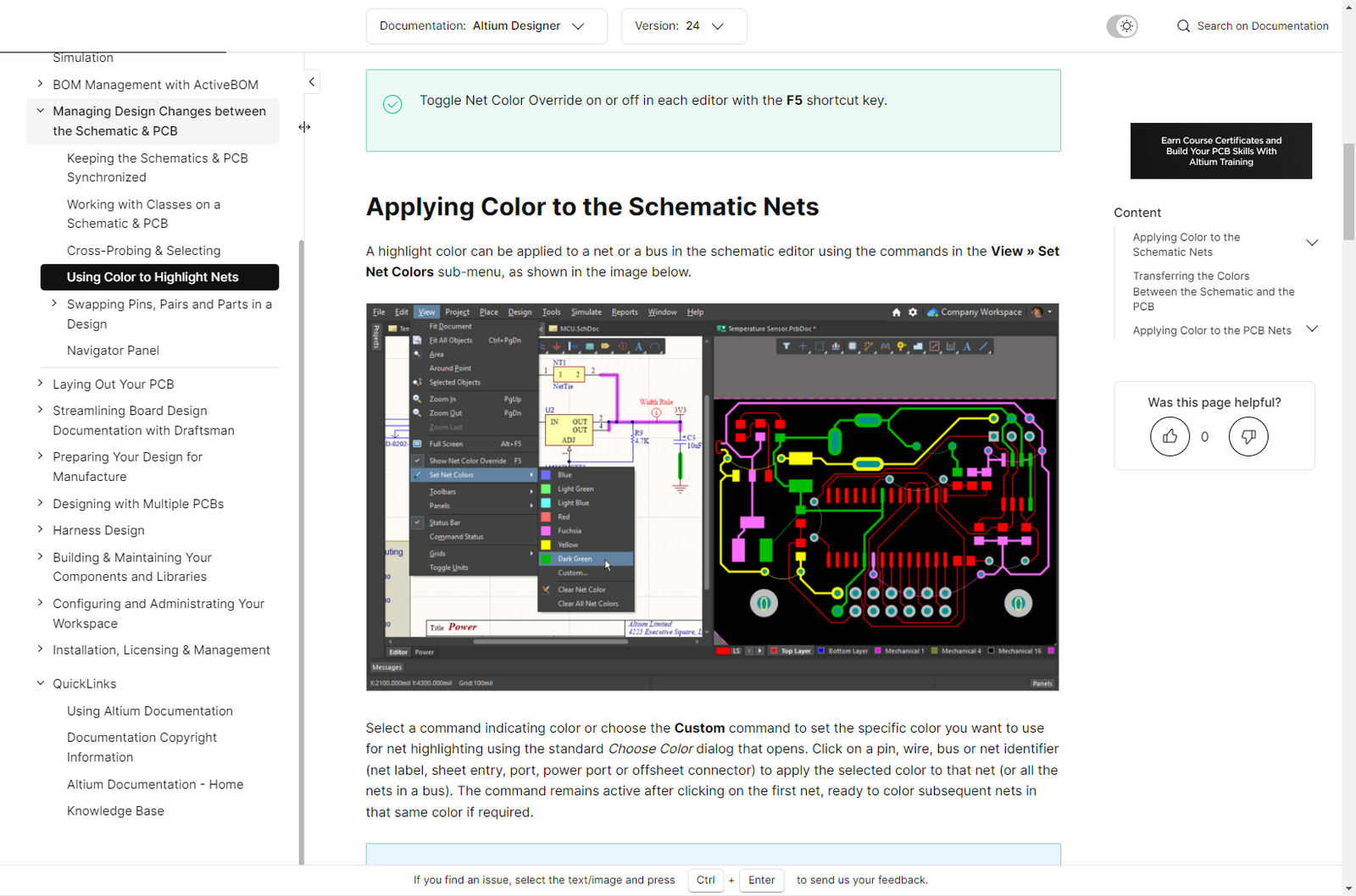
- Theme Selector - use this control to switch between light (
 ) and dark (
 ) presentation modes, as illustrated by the following example.
- Search - use this field to enter a search string and find information within the product documentation currently being viewed. Related search filters enable you to adjust the scope of the search thereafter. For more details, see Documentation Search Facility.
- Nav Tree Pane - presents all of the constituent paging for the product documentation being viewed. Logically gathered, click an entry to view that page. Controls at the pane's top-right enable you to resize it and/or control its visibility.
- QuickLinks - a dedicated and static component of the Nav Tree pane that is always presented, irrespective of the product documentation being viewed. It provides ready access to this page, copyright information and the main documentation gateway, as well as quick access to the Knowledge Base.
- Breadcrumbs - providing a secondary means of navigation, based on the active page being read, to parent pages above in the hierarchy.
- Main Page Content - this is the main area of the interface, presenting the page selected in the Nav Tree pane. For more details on various aspects of a page's content, along with tips on constituent features and functionality, see Viewing a Technical Document.
- Table of Contents - the Content region of the right-hand pane presents, where applicable, the structure of the active page, in terms of its headings (levels 2-4, since level 1 is the page's title). Click an entry to jump to that location on the page. Conversely, as you scroll the page, the Content region will update to track where you are within the document.
- Like/Dislike - the ubiquitous 'thumbs up/down' functionality, enabling you to quickly rate if a page was helpful or not and, where not, providing you the ability to let us know why (available when signed in to your Altium account). For more details, see Like/Dislike Functionality.
- Documentation Feedback (displayed when signed in to your Altium account) - this feature provides you with a quick avenue to send the Technical Documentation team your feedback on a page, geared more towards highlighting typos, incorrect/outdated information, or missing information. Simply select text and/or an image on the page and use the Ctrl+Enter keyboard shortcut to access the feature. For more details, see Documentation Feedback Mechanism.
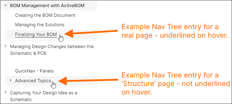
Structure Paging
Within the Nav Tree pane of the interface, you will sometimes encounter entries that, when clicked, do not present a page of documentation. These are by design and are used as a means to provide additional structure to the tree, where grouping of pages is needed under an umbrella 'parent', but information is not needed on the parent page itself. This type of page - a Structure page - is simply doing just that. As you move the cursor over such an entry, it does not get underlined (as the entry for a 'real' page of documentation does). When you click on such an entry, it just expands that section of the tree. Click again to collapse it.
Viewing a Technical Document
The following sections provide information about various aspects of the page content itself.
Document Conventions
| Bold |
Used to highlight a menu command, dialog control, button, toolbar, keyboard shortcut, or language keyword referenced in the text.
Examples:
- Use the Annotate Schematics Quietly command.
- If the Copy routed nets option is enabled in the dialog, routing from the source block will be placed.
- Click the Refresh button at the top of the Constraint Manager.
- Locating and using the Place Pad command (
 ) on the Active Bar or Wiring toolbar. ) on the Active Bar or Wiring toolbar.
- Right-click or press Esc to exit the placement mode.
- From i=1 to 20.
|
| Italic |
Used to highlight a panel or dialog referenced in the text.
Examples:
- The PCB CoDesign features are accessed and operated through the PCB CoDesign panel.
- Schematic annotation is configured using the Annotate dialog.
Italics are also used, where needed, to add emphasis to an important point.
|
Monospace |
Used to highlight a hard drive location, filename or file extension referenced in the text.
Examples:
- A selection of example designs is installed as part of the initial installation. In a standard default installation of the software, these can be found in the
\Users\Public\Documents\Altium\AD<Version>\Examples folder.
- This wizard-based installer is accessed by running a small (approx. 26MB) executable –
AltiumDesignerSetup_<Version>.exe.
- A Draftsman-based manufacturing drawing document can be added to a PCB design project (
*.PCBDwf), a Harness design project (*.HarDwf), or a Multi-board design project (*.MbDwf).
|
| Menu » Menu Item |
Main menu references in Altium Designer documentation use the » character as a separator. The first entry references the menu itself, followed by the command on that menu. If a command is accessed from a sub-menu, then an additional » character is used to indicate this.
Examples:
- Configuration for design rule checking is performed in the Design Rule Checker dialog accessed through the Tools » Design Rule Check command from a PCB document.
- Harness Entries are available for placement in the schematic editor. Choose Place » Harness » Harness Entry from the main menus.
|
| Tab | Group | Button |
Main menu references in CircuitMaker documentation use the | character as a separator. The first entry references the specific tab of the ribbon menu, followed by the group (or region) of the tab, and finally the button within that group. If a command is accessed from a menu associated to a button, then the » character is used to indicate this.
Examples:
- The View Configuration panel, which is used to configure what is currently displayed in the design space and how it is displayed, can be accessed from the PCB editor by choosing View | PCB | View Configuration.
- To move the currently selected objects, use the Tools | Arrange | Move » Move Selection command.
|
| Key 1+Key 2 |
When referring to shortcuts, use of the plus (+) symbol denotes holding multiple keys down on the keyboard in the indicated sequence.
Examples:
- Shift+H (to toggle the Heads Up Display On or Off in the PCB editor).
- Shift+Ctrl+X (to toggle Cross Select Mode On or Off in the schematic/PCB editors).
|
| Key1, Key 2 |
When referring to accelerator key sequences, use of the comma (,) symbol denotes pressing each key in the sequence in succession.
Examples:
- X, A (in the schematic editor, to deselect all objects on the current sheet).
- P, V, K (in the schematic editor, to place a compile mask directive).
- T, D, R (in the PCB editor, to run a batch Design Rule Check).
|
| Link |
A normal hyperlink to a target that could be:
- To another area of the same page.
- To a different page within the same product documentation set.
- To a different page within a different product documentation set.
- To a page outside of the technical documentation.
|
|
Info Box
|
Use to highlight some key additional information regarding a particular topic being discussed on the page.
Example:
The source for BOM data of a harness design project is the project's Layout Drawing. So if the Wiring Diagram of your harness design was changed and this change should be reflected in the BOM, the Layout Drawing must be updated first.
|
|
Feature/Tip Box
|
Used to highlight a particular feature or functionality to be aware of, or a tip to using such.
Example:
The set of Altium Designer's example projects includes a sample harness design project (Harness_Demo_Prj.PrjHar in the C:\Users\Public\Documents\Altium\AD<version>\Examples\Harness Demo MB\Harness_Demo_Prj folder by default), which is associated with a multi-board demo project (\Examples\Harness Demo MB\Harness_Demo_MB\Harness_Demo_MB.PrjMbd), so you can take harnesses for a test drive straight out of the box.
|
|
Warning Box
|
Used to highlight something that is important to be aware of or that should be performed.
Example:
Note that Harness Design functionality is not supported with the Altium Designer Standard Subscription. The functionality is available when using an Altium Designer SE or full-featured Altium Designer license.
|
Engaging Visuals
Throughout the documentation, you will find a variety of visual elements employed, to convey information in a more engaging way. The following sections illustrate how these appear on a page and how they are used.
Static Image
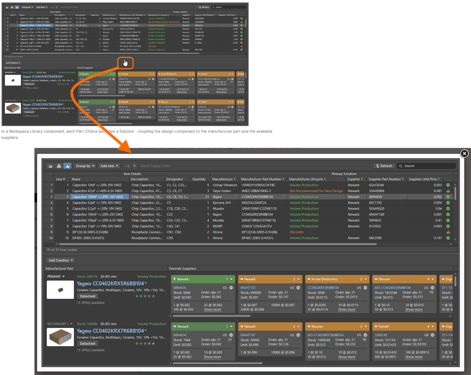
The humble static image is a cornerstone of the technical documentation, used in conjunction with surrounding text to faithfully provide detail about a key aspect of the software.
In order to keep the presentation (and readability) of a document manageable, there is a fixed width employed for a page. As such, imagery is typically not able to be presented, by default, in full size. As you hover the cursor over an image, it will change from a pointer icon ( ) to a hand icon (
 ). This indicates that when you click on the image, you will be presented with its full size version in a floating window (where applicable and in accordance with the current sizing of your browser window). The following image illustrates this for a static image in the documentation (ironically, you'll need to click on the image to see it full size).
Slideshow
A slideshow element can comprise several images (and videos) to cleanly show more visual information, along with captions. This element is especially useful when illustrating progression or a stepped-sequence to follow, when using a particular feature of the software.
The following image illustrates an example slideshow in the documentation and highlights some key areas, described thereafter.
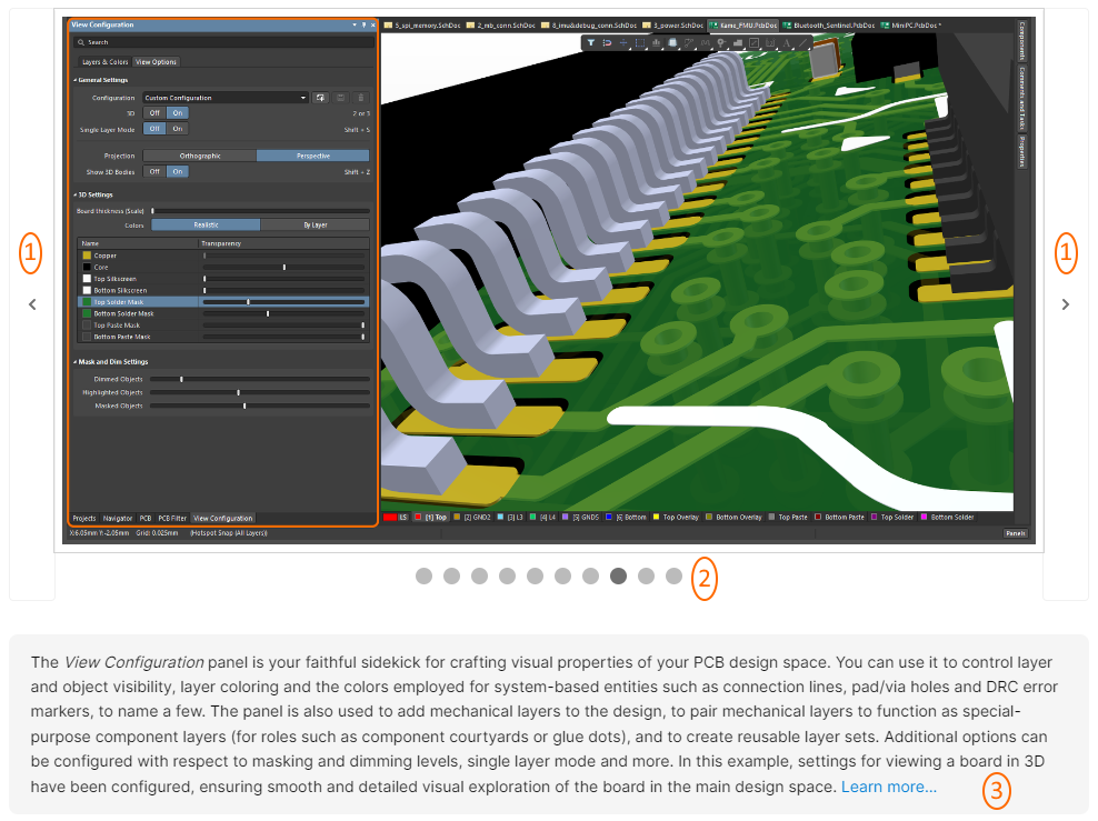
- Use these controls to cycle forward and back through the slideshow respectively. As you hover over an area, it will become darker. You can click anywhere within the 'arrow frame', not just on the arrow icon itself.
- These 'bubbles' reflect how many slides are in the show and where in the set you are (darker bubble). You can click on a bubble to quickly jump to that slide.
- A slideshow can include captions - one caption per slide. These will update as you click through different slides.
As with normal imagery, you can click on a slide to view it full size. Arrow controls appear as you move the cursor to the left and right, enabling you to flick through the slides while remaining in this 'full size' mode.
Example Slideshow
The following is a real example of a slideshow visual used in the documentation. In this case, it provides a collated visual of the drawing objects available for use in Altium Designer's Draftsman editor. Note that captions are used with this slideshow, changing as you move through the slides.
❯ ❮
Javascript ID: DraftsmanDesignObjects
|
The Draftsman editor allows a range of automated production drawings to be placed directly onto a Draftsman document. Shown here are a Board Assembly View, Board Fabrication View, Board Isometric View, Board Detail View and Board Realistic View. The first three views are specific to a Draftsman-based manufacturing drawing created for a PCB design project (*.PCBDwf). A Board Realistic View can be placed in a Draftsman-based manufacturing drawing created for a PCB design project (*.PCBDwf) or Multi-board design project (*.MbDwf).
Additional automated design views available - Drill Drawing View, Layer Stackup Legend, Via Type View and Counter Hole View. Note that all of these views are specific to a Draftsman-based manufacturing drawing created for a PCB design project (*.PCBDwf).
Additional automated design views available - Board Section View, Board Region View and Component View. The first two views are specific to a Draftsman-based manufacturing drawing created for a PCB design project (*.PCBDwf). A Component View can be placed in a Draftsman-based manufacturing drawing created for either a PCB design project (*.PCBDwf) or a harness design project (*.HarDwf).
Shown here is a Multi-board View, which is specific to a Draftsman-based manufacturing drawing created for a Multi-board design project (*.MbDwf).
Shown here is a Section View, which is specific to a Draftsman-based manufacturing drawing created for a Multi-board design project (*.MbDwf).
Shown here is a Wiring Diagram View, which is specific to a Draftsman-based manufacturing drawing created for a harness design project (*.HarDwf).
Shown here is a Layout Drawing View, which is specific to a Draftsman-based manufacturing drawing created for a harness design project (*.HarDwf).
The Draftsman editor provides a range of data tables, whose data is drawn directly from the applicable source design project document. Shown here are a Bill Of Materials, Table, Drill Table, and Transmission Line Table, the latter two of which are specific to a Draftsman-based manufacturing drawing created for a PCB design project (*.PCBDwf). Also shown are a Wiring List and Connection Table, which are specific to a Draftsman-based manufacturing drawing created for a harness design project (*.HarDwf).
The Draftsman editor provides a range of additional drawing and annotation tools designed to add important information to a Draftsman drawing document. These include both automated note and highlighting systems. Shown here are a Callout, Center Mark, Note, Datum Feature, Surface Finish, Comment, Feature Control Frame, and Text. Note that use of Comments is specific to a Draftsman-based manufacturing drawing created for a PCB design project (*.PCBDwf).
The Draftsman editor provides a range of dimensioning objects. Dimension graphics may be placed on Board Views (Assembly, Fabrication, Section, Details, Wiring Diagram, Layout Drawing, etc...) to indicate the lengths, sizes, and angles of the object outlines, or the distance between nominated objects. Shown here are a Linear Dimension, Radial Dimension, Diametral Dimension, Angular Dimension, and Ordinate Dimension. Also shown are a couple of X,Y Axis Scale objects. All of these objects can be placed in a Draftsman-based manufacturing drawing created for a PCB design project (*.PCBDwf), Multi-board design project (*.MbDwf) or harness design project (*.HarDwf).
The Draftsman editor also provides a range of graphical element tools that can be used to place basic, free-form drawing elements in a document. Shown here are a Line, Arc, Circle, Rectangle, Region, and Graphic. All of these objects can be placed in a Draftsman-based manufacturing drawing created for a PCB design project (*.PCBDwf), Multi-board design project (*.MbDwf) or harness design project (*.HarDwf).
|
Animated Gif
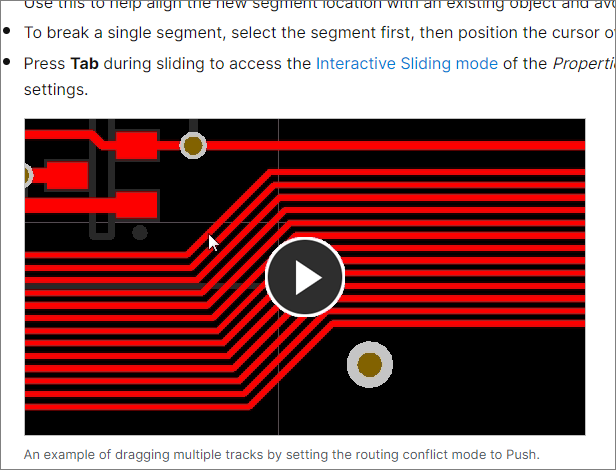
An animated Gif is used when there is a need to capture a process or aspect of the software in video-like fashion, but where the visual illustration is short in length and using a video would be overkill. An animated gif in the documentation is distinguished by having a noticeable 'play' button at its center, as illustrated in the following image. After clicking on the button, the gif will play to its end and stop, displaying the play button once again.
Example Animated Gif
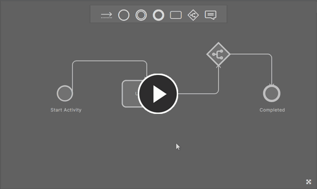
The following is a real example of an animated Gif visual used in the documentation. In this case, it illustrates modification of existing connections when using the Process Workflow Editor (used when building/modifying a Process Workflow in a connected Workspace), using the various editing handles that appear when hovering over a connection.
Video (MP4)
A video, like a gif, is used when there is a need to visually capture a process or aspect of the software being 'performed', and where such visual content is lengthier than that suitable for a gif. A video in the documentation is distinguished by a control panel towards its bottom, as illustrated in the following image. Click anywhere on the video to start playing it (you don't have to click on the play arrow at the bottom-left). Click again (anywhere on the video) to pause. Use the available video controls to, for example, switch to full size and back, skip forward and back along the timeline, and to change the playback speed.
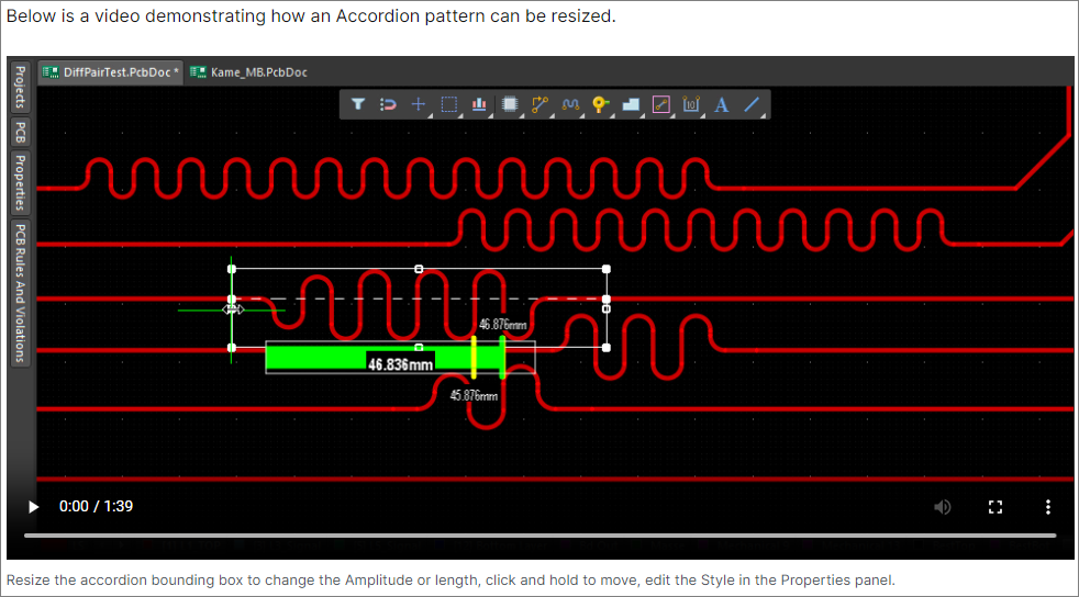
Example Video
The following is a real example of a video visual used in the documentation. In this case, it is used to illustrate use of shortcut keys when using the Interactive Length Tuning tool.
Hover Image
A hover image is used to present a 'before and after' scenario or some sort of comparison, with respect to a feature or function of the software. It consists of two images only. It appears on the page just like a regular static image, with its first image presented by default. On hovering the cursor over it, the second image appears.
The following is a real example of a hover image visual used in the documentation. In this case, it is used to illustrate shielding vias (default/first image) and stitching vias (second image, accessed on hover).
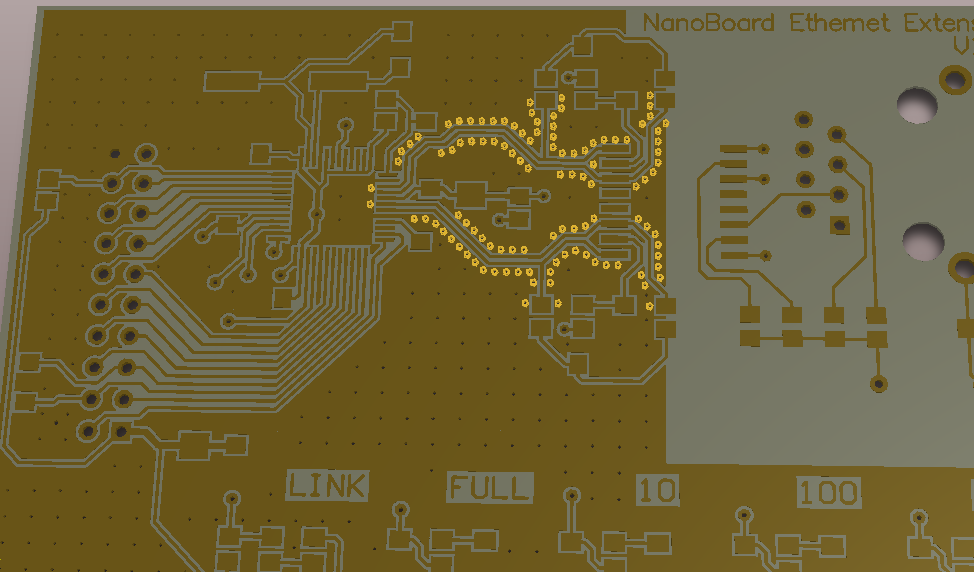
Note that while you can click on a hover image to view it full size, this only works for the base/first image.
Pop-up Image
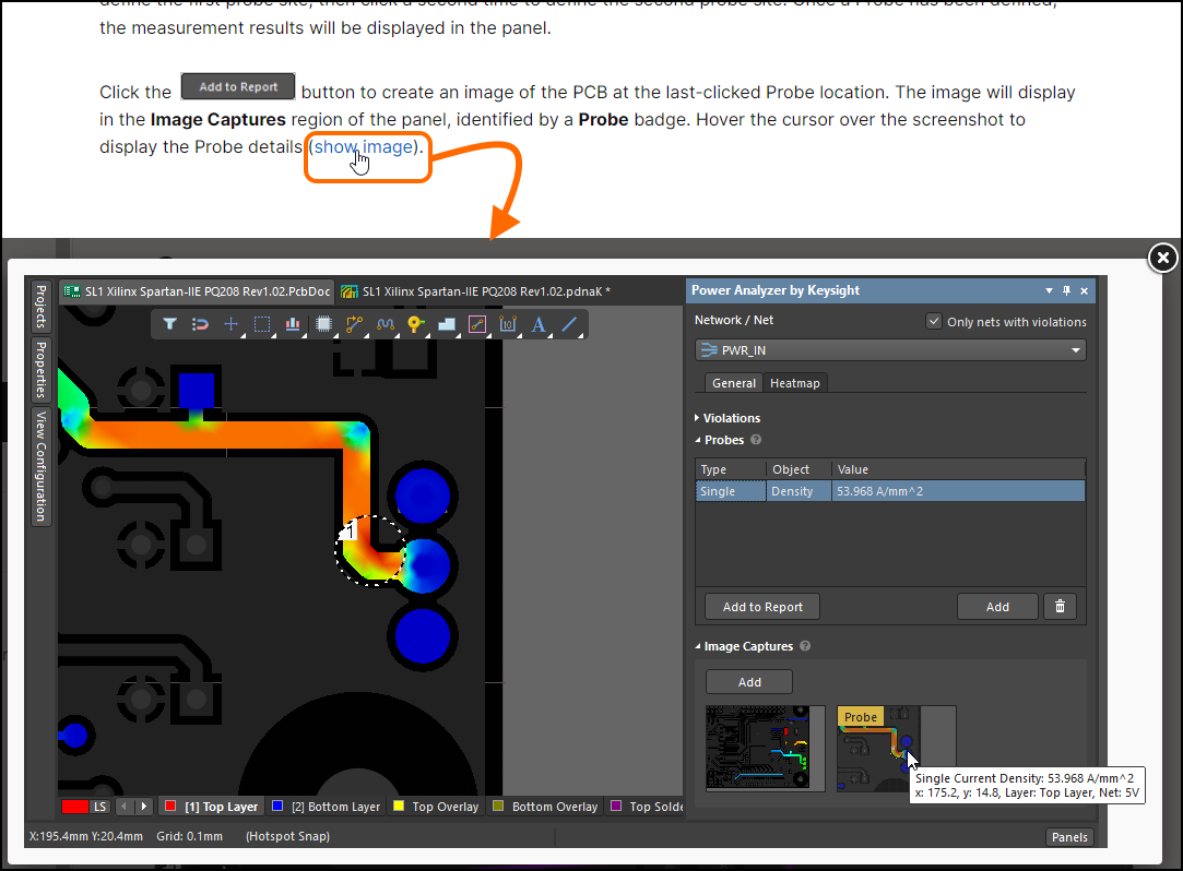
A pop-up image is used to show something in the context of surrounding text, without specifically adding that image to the content flow. In this respect, it could be considered more of an 'aside' or example, reinforcing a comment or statement made in the text. Such an element appears as though it is a normal hyperlink, but will include wording to highlight it as something that will be 'shown' or an 'example' given, when clicked. The following image shows a pop-up image link when clicked, which yields the full size image.
Getting a Link to the Page or a Specific Section
When wanting to share a page with others, you need to be able to quickly get at its URL. This can be obtained (copied to the Windows Clipboard) in a couple of ways:
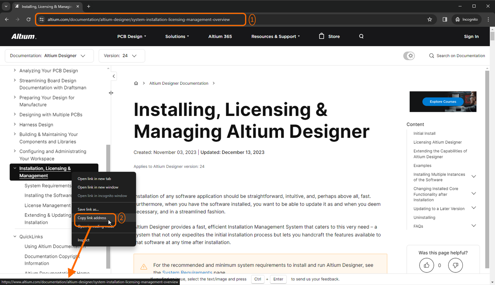
- From your Browser's Address Bar when you first access the page.
- By right-clicking on the entry for the page in the left-hand Nav Tree, then using the Copy link address command on the context menu.
Extending this further, you can also obtain a URL to a specific section of the page you are currently reading, as follows:
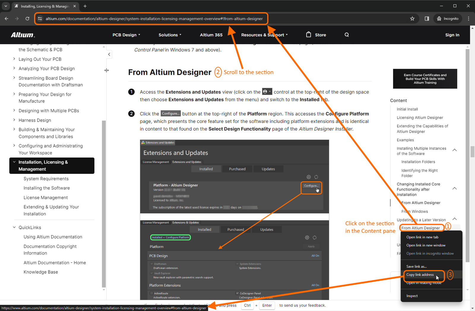
- Use the right-hand pane to access the desired section within the page's Content structure, then copy the URL from your Browser's Address Bar.
- Scroll down the page to the desired section. As you scroll, your Browser's Address Bar updates to reflect the current section you have reached.
- Right-click on the entry for the desired section within the page's Content structure (in the right-hand pane), then use the Copy link address command from the context menu.
In addition and for main section headings, you can click the 'Copy Link' control to the left of a main section's header.

Versioned Documentation
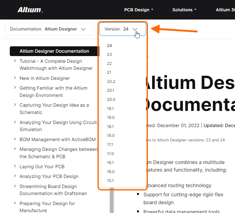
For some of Altium's design solutions, including Altium Designer, the associated technical documentation is versioned. This enables you to select the correct version of documentation for the version of software you are using. The version can be selected either from the main documentation gateway (from the relevant product tile's QuickLinks menu) or at any time within the product documentation, using the version selector available in the upper banner area, as shown below.
A page in the documentation starts life at a particular version - its 'Base' version. Note that only the versions of software for which the page is available are shown listed in the selector control.
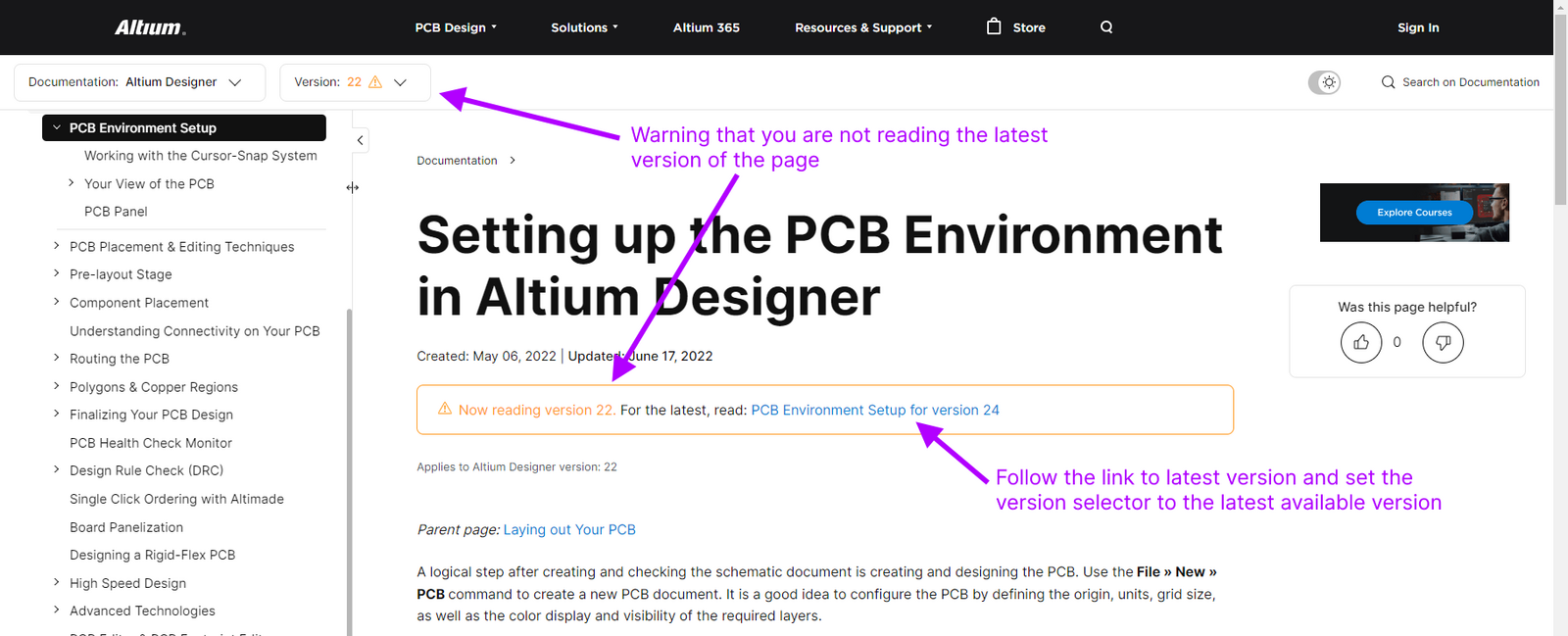
The versioning system alerts you if you are reading a page that is not the latest version of that page. It does this in two ways:
- The version number in the drop-down version selector is displayed in a different color and noted with a warning symbol.
- A warning is provided at the top of the page, with a link to the latest version. Following the link will switch the entry in the version selector to the latest available version automatically.
Applicable Versions
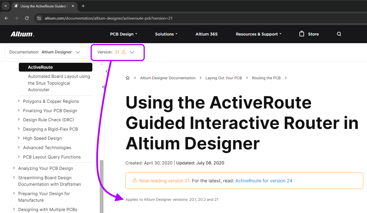
While software evolves from version to version, adding new features and enhancements to its functionality, the associated documentation may be impacted only in certain areas. Many pages will not be affected by the next version of the software, so the same content that is applicable previously, also now applies to that later version as well. Indication is therefore provided on each page, to show which versions of the software that page's content can be used for.
The following image illustrates such indication. Here, version 21 of the page detailing the ActiveRoute feature (in Altium Designer) is open. This content equally applies to versions 20.1 and 20.2 of the software. In other words, there is no difference in content for the page if you set the version selector for the documentation to 20.1, 20.2 or 21.
Retired Documentation (Altium Designer Documentation)
Where a page has been (or is being) retired from the Altium Designer documentation set - available up to a certain version of Altium Designer - it is moved to the Retired Documentation section of the Nav Tree pane. An entry here still applies to your currently chosen version of the documentation, but may not apply to the next, or a future version.
The Retired Documentation section does not present for the latest version of Altium Designer documentation, since it is only meaningful to present such retired paging in an earlier version.
By gathering 'End of Life' paging here, it is easier for you to quickly see when a document 'disappeared' from the main documentation set, without having to trawl the entire nav tree structure to see where, and what, changed. Simply use the Version selector in the upper banner area to reveal pages that existed for a previous version. For convenience, pages have been categorized to avoid a potentially overwhelming flat listing.
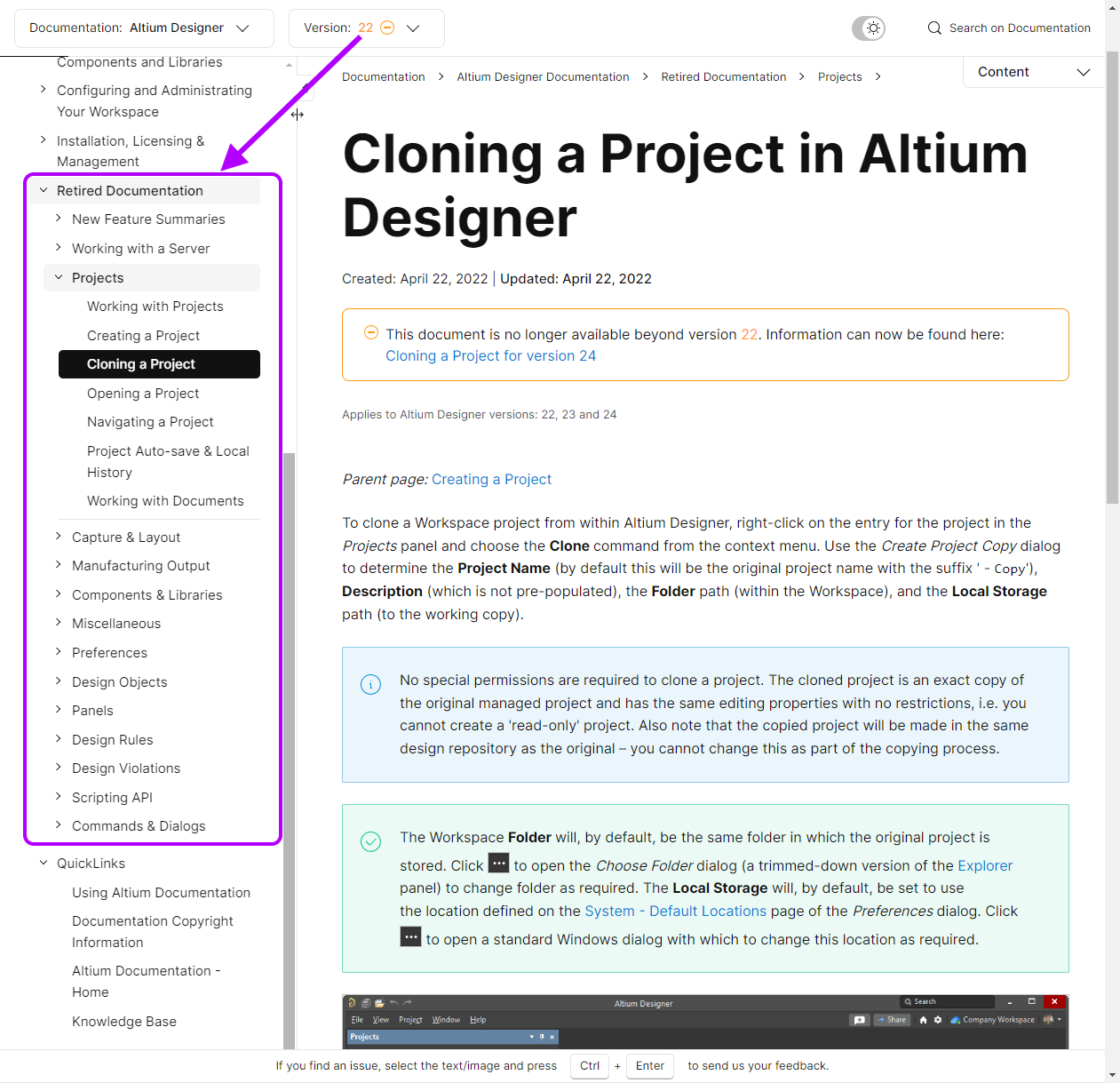
Notice also, that for each retired page there is an additional info banner that provides a target destination, so that you are not left stranded. Typically, where information is now available elsewhere within the documentation set, one or more links are provided to where that information now resides, in the latest version documentation, as illustrated by the following image.

If there is no continuation of information, for example a feature is no longer available in the software, a link to the home page for the documentation set is provided.
Documentation Search Facility
Aiding to help you find information within the technical documentation for Altium design solutions, is a powerful Search facility. Powered by Google, there is in fact one search facility for the entire altium.com site. How and where you access the search, determines how 'filtered' your initial results will be:
- From the top-level site banner - accessed and used as illustrated in the following slideshow. Search is performed across the entire site, with results presented on a separate browser tab.
❯ ❮
Javascript ID: SiteSearch
|
- From the 'front door' of the technical documentation (altium.com/documentation) - accessed and used as illustrated in the following slideshow. Search is performed across all sets of technical documentation available for the various Altium design solutions, as well as the Knowledge Base. Results are presented on the same browser tab.
❯ ❮
Javascript ID: SearchFromFrontDoor
|
- From a page within technical documentation - accessed and used as illustrated in the following slideshow. Search is performed only within the active documentation set currently being viewed and, if versioned, only within the specific version currently selected. Results are presented on the same browser tab.
❯ ❮
Javascript ID: SearchFromDoc
|
The third option in the list above offers the most focused search, reducing the level of 'noise' from other locations outside of the specific documentation set you are currently browsing. However, no matter which method of access you use, you can configure the filtering as needed to the left of the results and click the Apply button to run the search again.
To search for a specific text string, enclose your search string in double quotes ("<String>"), for example: "Unified Design Environment".
QuickNav Paging (Altium Designer Documentation)
With respect to design objects and panels in Altium Designer, information about these elements is dispersed over a great many pages within the Altium Designer documentation set. To provide a means with which to easily navigate to such information, the concept of QuickNav paging has been employed. Analogous to a 'store directory' map in a shopping complex, a QuickNav page provides quick reference information about the design elements available for a particular area of design, giving you a means to quickly navigate to more detailed information about each.
In most cases, a QuickNav page will present information in three distinct sections:
- Graphical Overview - a collated visual of commonly used objects, for example.
- Slideshow - presenting more overview information regarding some of the elements that you'll use more regularly.
- A-Z Listing - a convenient alphabetical listing. No frills, no fuss. Just direct links to the detail for a particular element.
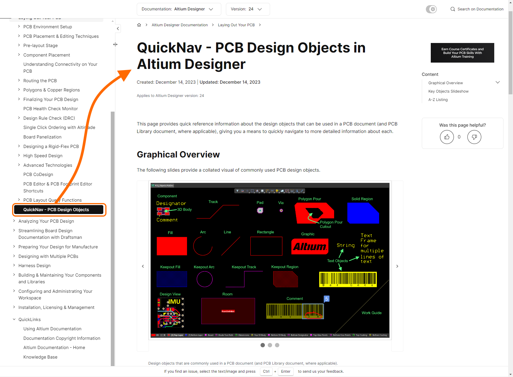
QuickNav paging is available for the following:
Like/Dislike Functionality
To enable us to obtain coarse-level analytics for the paging in the technical documentation, the ubiquitous 'Thumbs Up/Down' feature is employed. This allows us to see how useful a page is and, if it isn't, schedule it for some remedial attention. You'll find controls for the feature located beneath the Content (ToC) region for the page, in the right-hand pane. Click once on a thumb icon to register you 'vote', click again to remove it. If you click on the Thumbs Down icon AND you are signed in to your Altium account, you will have the opportunity to provide feedback as to why the page wasn't useful to you. This sends a report directly to the Technical Documentation team.
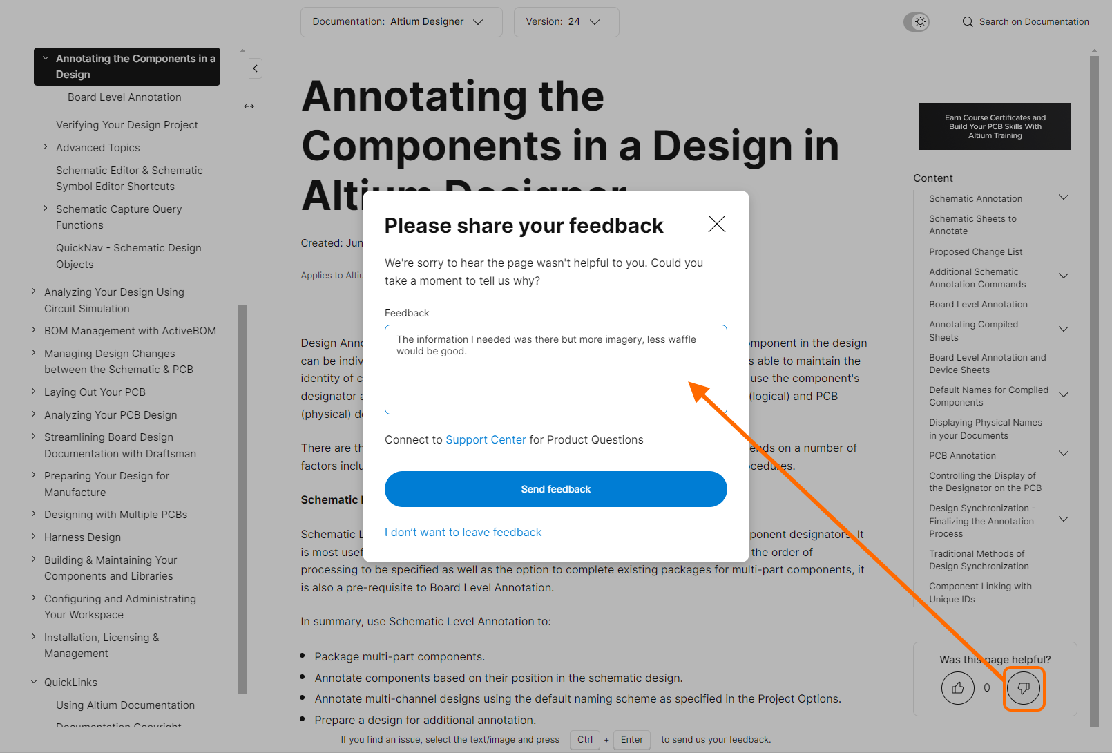
Please restrict your 'dislike feedback' to the active page. For technical assistance, refer to the
Altium Forums or click
Support Center in the
Please share your feedback window.
Documentation Feedback Mechanism
From time to time you may encounter/discover an issue with a document, such as a typo, access problem, incorrect/unclear information, or outdated information. To err is only human and we look to you, our readers, to help us correct those issues. To this end, the technical documentation incorporates a feedback mechanism that can be accessed from any page, that sends a report directly to the Technical Documentation team.
This feedback mechanism is accessed by using the Ctrl+Enter keyboard shortcut. If there is a particular section of text and/or imagery that you want to reference, select it (maximum 200 characters) before pressing Ctrl+Enter.
A handy reminder of the feature and its shortcut is provided in the banner at the bottom of each page, when you are signed in to your Altium account.
After accessing the feature, the Report Document Issue window is displayed, with the referenced text/imagery added (if applicable). Use the Issue field (max 500 characters) to provide as much detail as possible - it truly helps us to investigate and resolve a valid issue with a quicker turnaround. Once ready, click the Send Feedback button to submit. A confirmation thank you message reflects successful submission and receipt of your report. It cannot be stressed enough how important your feedback is to us and therefore genuinely appreciated!
❯ ❮
Javascript ID: Doc_Feedback
|
Please restrict your feedback to documentation issues. For technical assistance, refer to the
Altium Forums or click
Support Center in the
Report Document Issue window.
Support for Viewing on any Device
Gone are the days when every designer sits in front of a desktop computer with a single 1280x1024 monitor. Today our desktop PCs have multiple monitors of various sizes and resolutions. We also need to be able to work from a laptop when in the field or at the client’s office. Also, since we’re knowledge geeks, we also like to be able to use our tablet or phone to soak up more information while we’re waiting for that flight or catching the bus to the office.
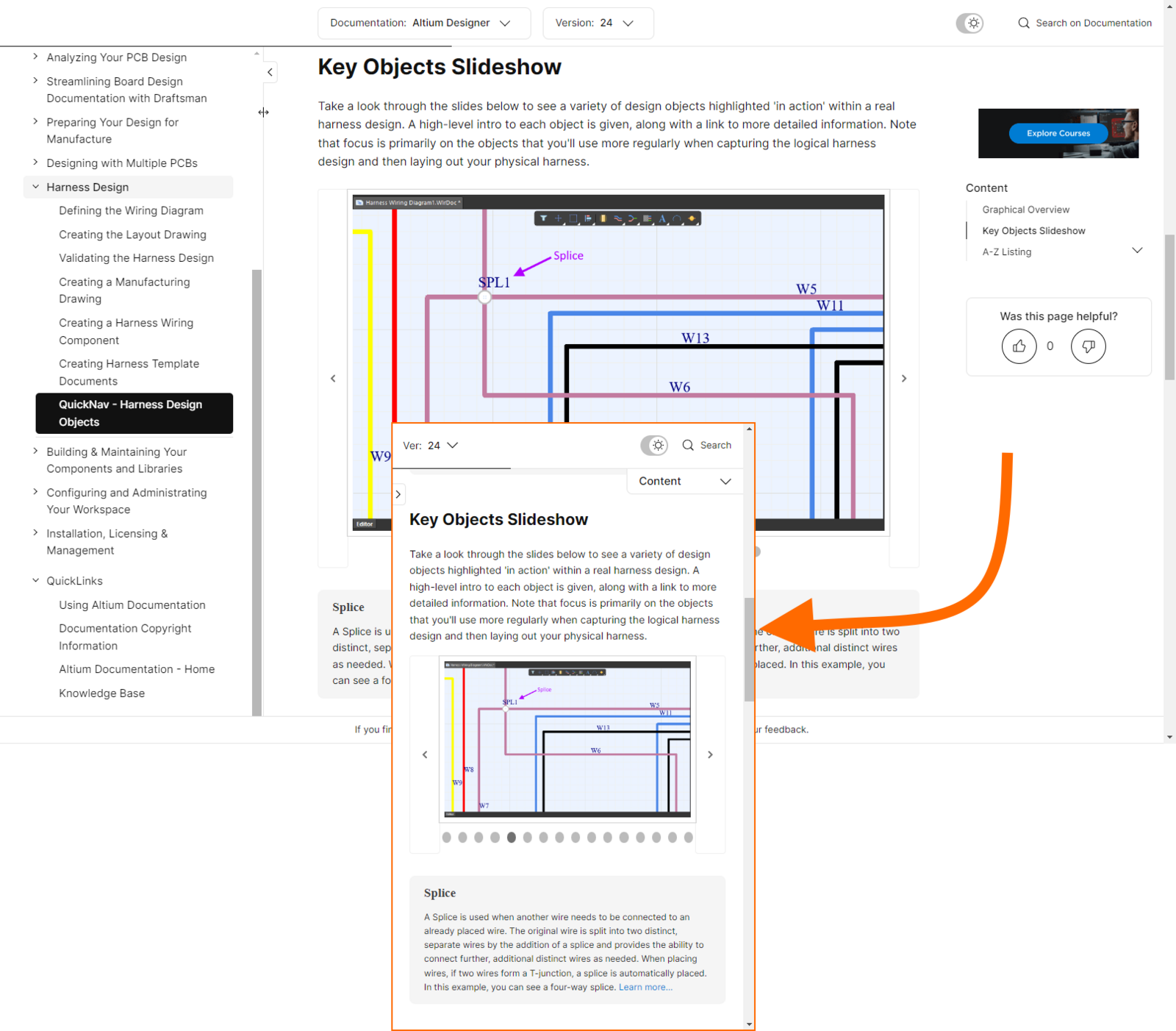
To present the content so that it works on all of these different devices, the technical documentation (as a part of the parent altium.com website) employs responsive web design. A responsive website communicates with the target device and adjusts the layout and size of the content to suit that device, screen resolution and browser size. You can get a taste of this by resizing your browser; as you shrink the width, the page elements rearrange and the fonts and images get smaller. Even on a 5-inch screen the site is functional with, for example, the navigation tree still available on your tablet or phone as a drop-down.
Printer-friendly Documentation
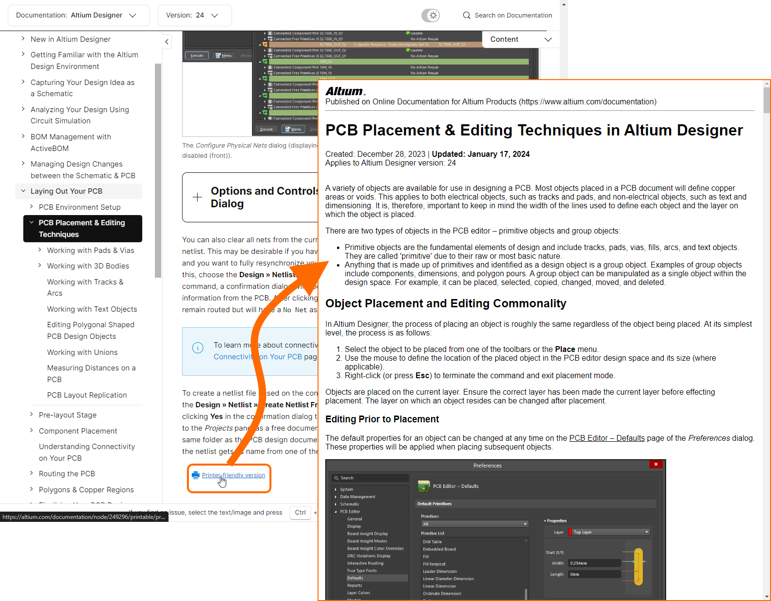
Looking to print some of the technical documentation? Since we embrace 'online' functionality and also use a lot of snazzy visual effects to convey the information, you'll first need to ensure a page is prepared ready for sending to your faithful printing device. At the bottom of each page you'll find a control to do just that, enabling you to obtain a printer-friendly version of the page.
Localized Documentation
Some of our content is available in languages other than English. Use the language selector at the bottom-left of any page on the altium.com site to select the desired language from those currently supported.

The alternate language content for a particular version of a page will automatically be presented if available, otherwise the English content will be displayed. The following slideshow illustrates localization in action for new feature content that is available in English, Japanese and Chinese.
❯ ❮
Javascript ID: Localization
|
Browser Translation (Unofficial)
Depending on your preferred Web Browser, you may have access to temporary, on-the-fly translation of the active page you are reading. The following slideshow illustrates use of Google Chrome's Translate feature to quickly view the page in one of a myriad of supported languages, in this case German. Only the active page is translated (and the Nav Tree). Note also that translation is temporary - clicking to another page and back, or refreshing the page will revert back to the original language being viewed.
Use of such a browser-based translation feature is 'as is' and is not officially translated content provided by Altium.
The Knowledge Base
People often find their way into Altium's Knowledge Base and assume that it is the extent of our technical documentation. In actual fact, it is a separate resource in its own right. Indeed, the two form a symbiotic relationship where the Knowledge Base and Technical Documentation interlink and complement one another, to get you the information you seek.
The Knowledge Base is a 'go-to' point of self-service, whose content is curated by members of Altium's Support organization - people that have expert knowledge in Altium solutions. That content is built directly from issues other users have encountered. The result is an organic repository of articles providing targeted answers/solutions for topics and corner cases. Pin-pointed, quick-read articles to get you back up and running again.
The interface to the Knowledge Base is simplicity itself. You can opt to search across all articles or target articles in one of the supported design solution categories. Then, just start typing a search string - filtering will be applied as you do so. When you find an article of interest, click on its entry to open that article.
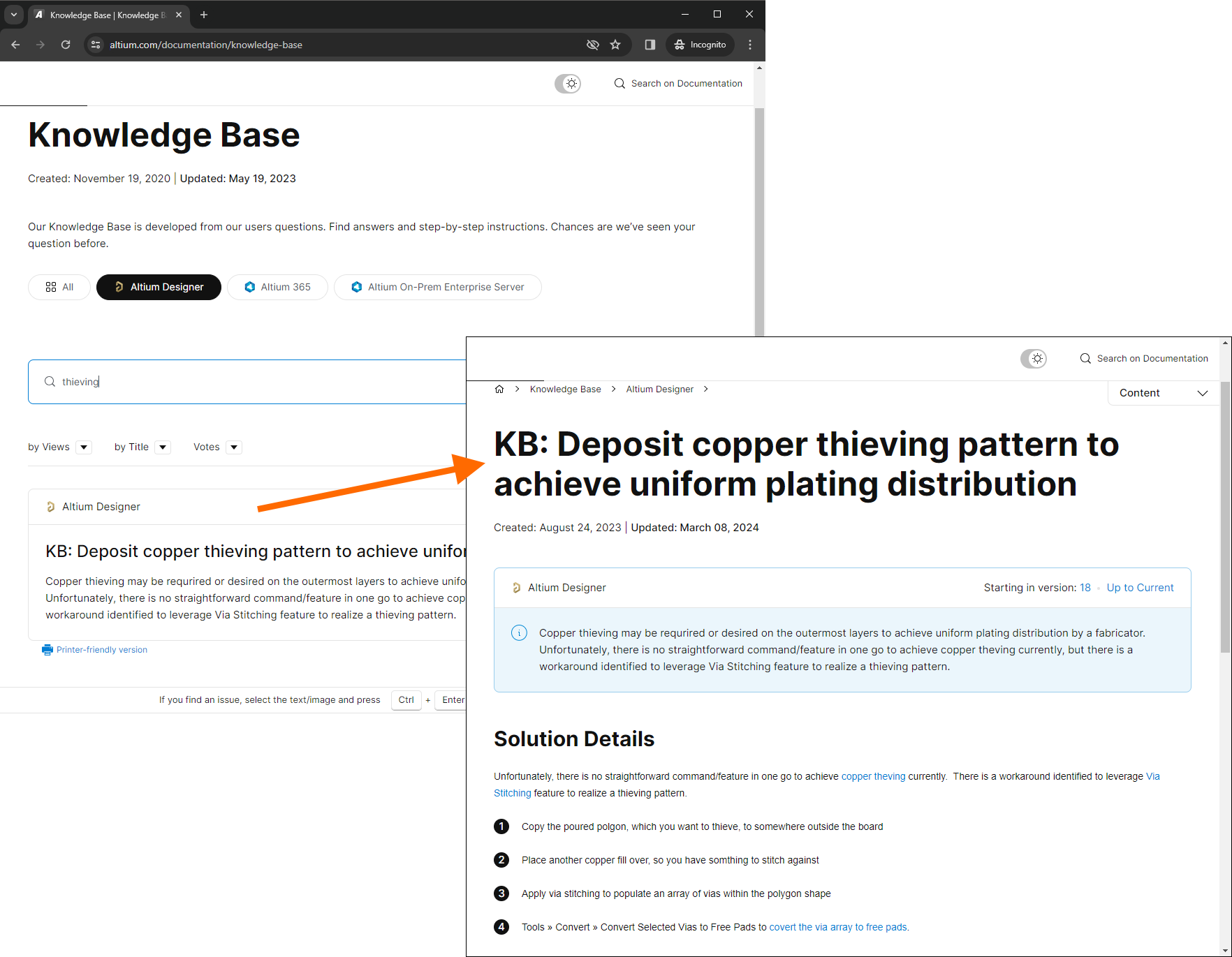
Most of the Knowledge Base articles include links across to the Technical Documentation to get at that broader, deep-dive information on a feature of an Altium design solution.
A Parting Quote...
"The best documentation is that which keeps evolving, getting better and better with the passage of time. Fresh ideas to take what is great and make it greater, always with the user in mind."
Very much a mantra that the Technical Documentation team abides by and strives to deliver upon. Moving forwards, the technical documentation will continue to be evolved, particularly from the perspective of usability. After all, having an abundance of information is only useful if our users can find it. As new developments, enhancements and functionality are made available, this page will be updated to reflect and highlight those additional elements, and how to best use them to get at the information you seek.